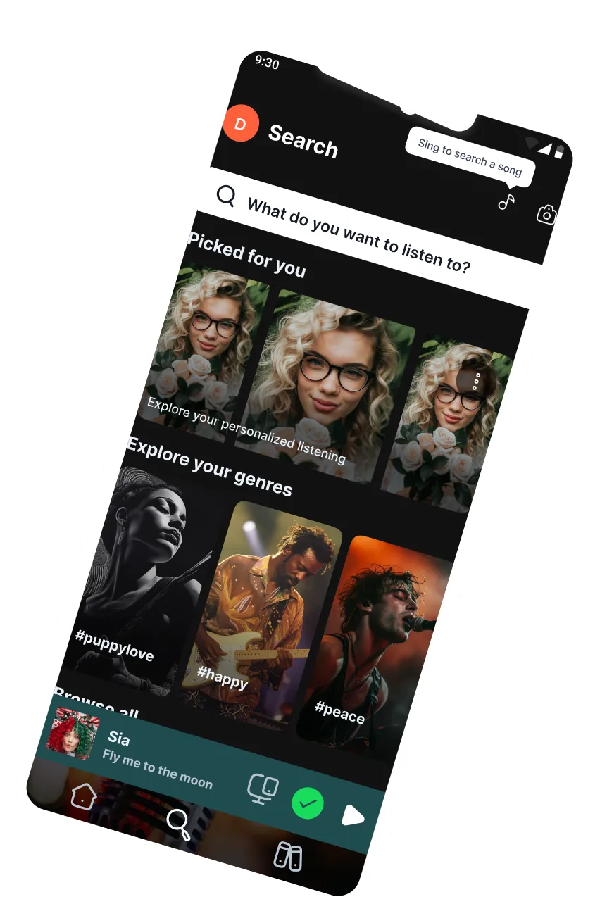
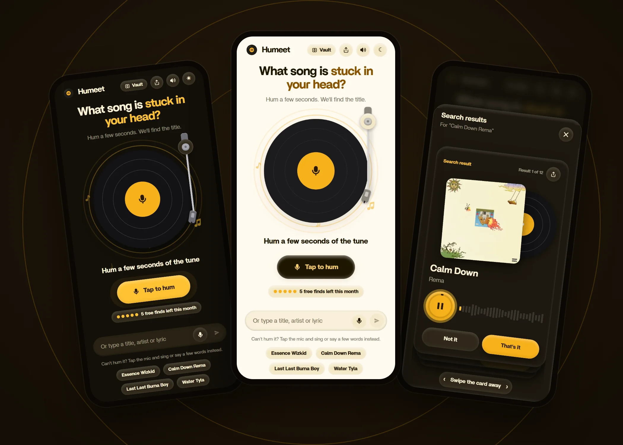
Humeet: hum a few seconds, get the song title.
Solo-built in 2 weeks. Live: 420 visitors from 17 countries.
I design calm interfaces for complicated products. Turning complexity into intuitive experiences people actually enjoy using.
My work spans UX/UI, design systems, visual direction, and AI-assisted development, transforming complex problems into products that are intuitive, scalable, and commercially effective.
Solo-built in 2 weeks. Live: 420 visitors from 17 countries.
Solo project, January 2026. Live, with five core features.
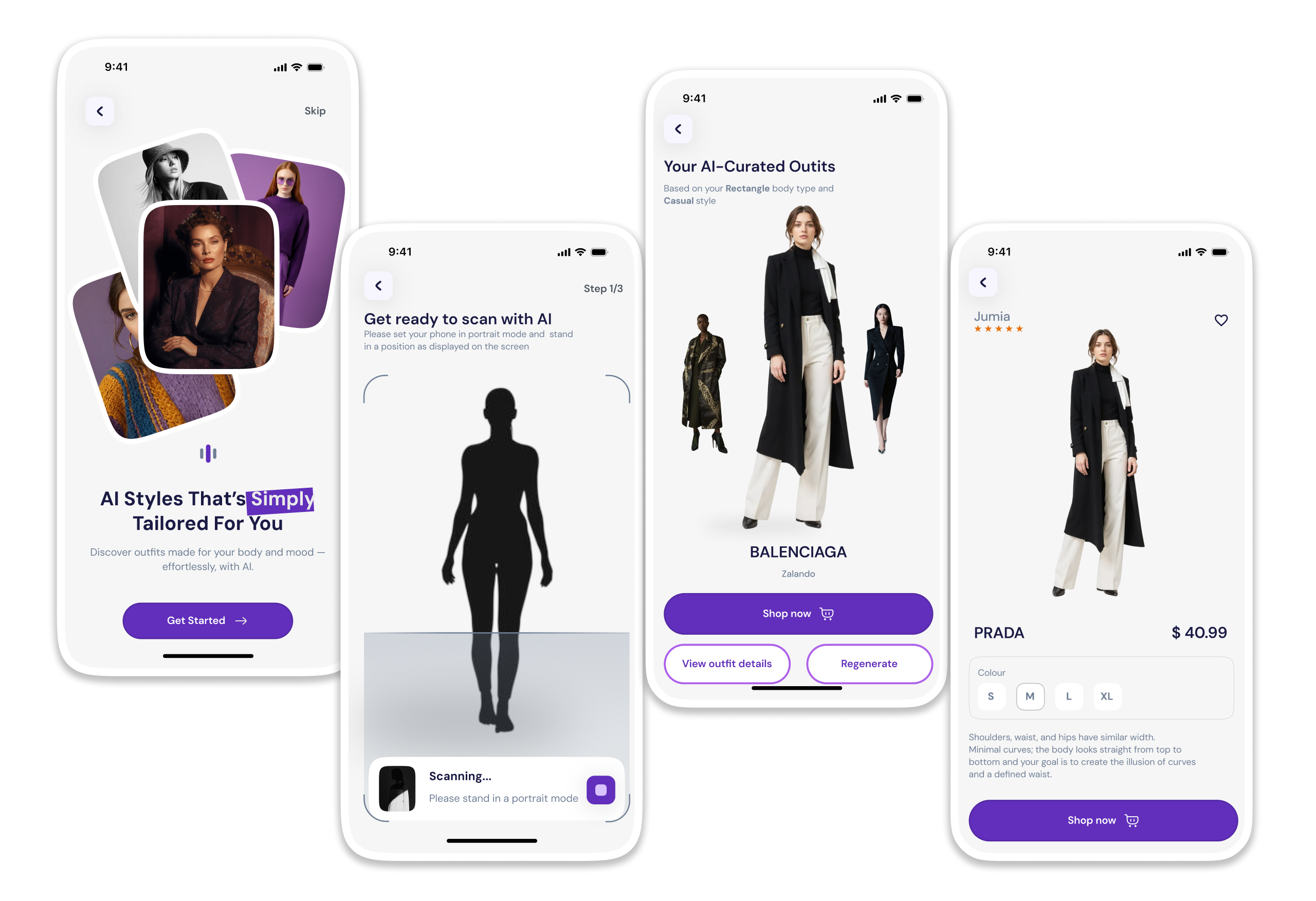
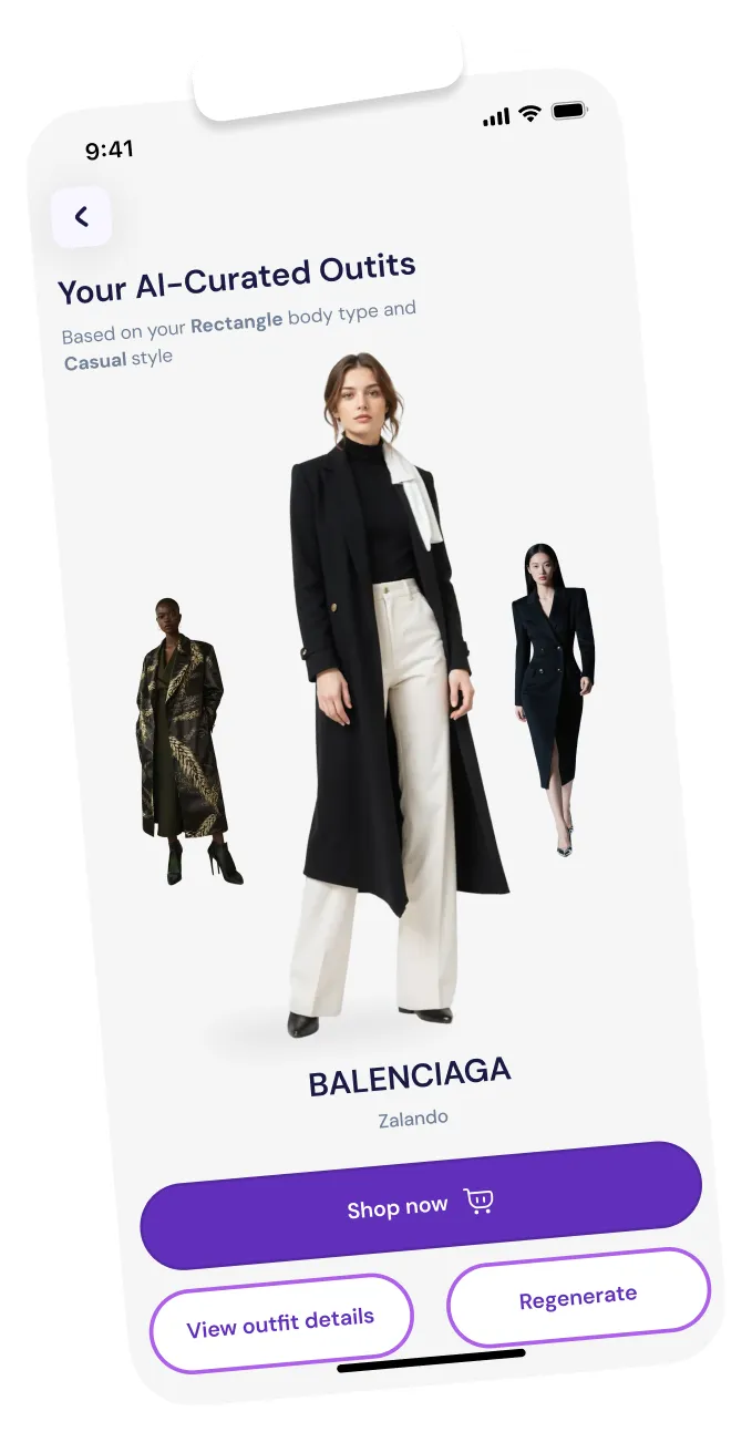
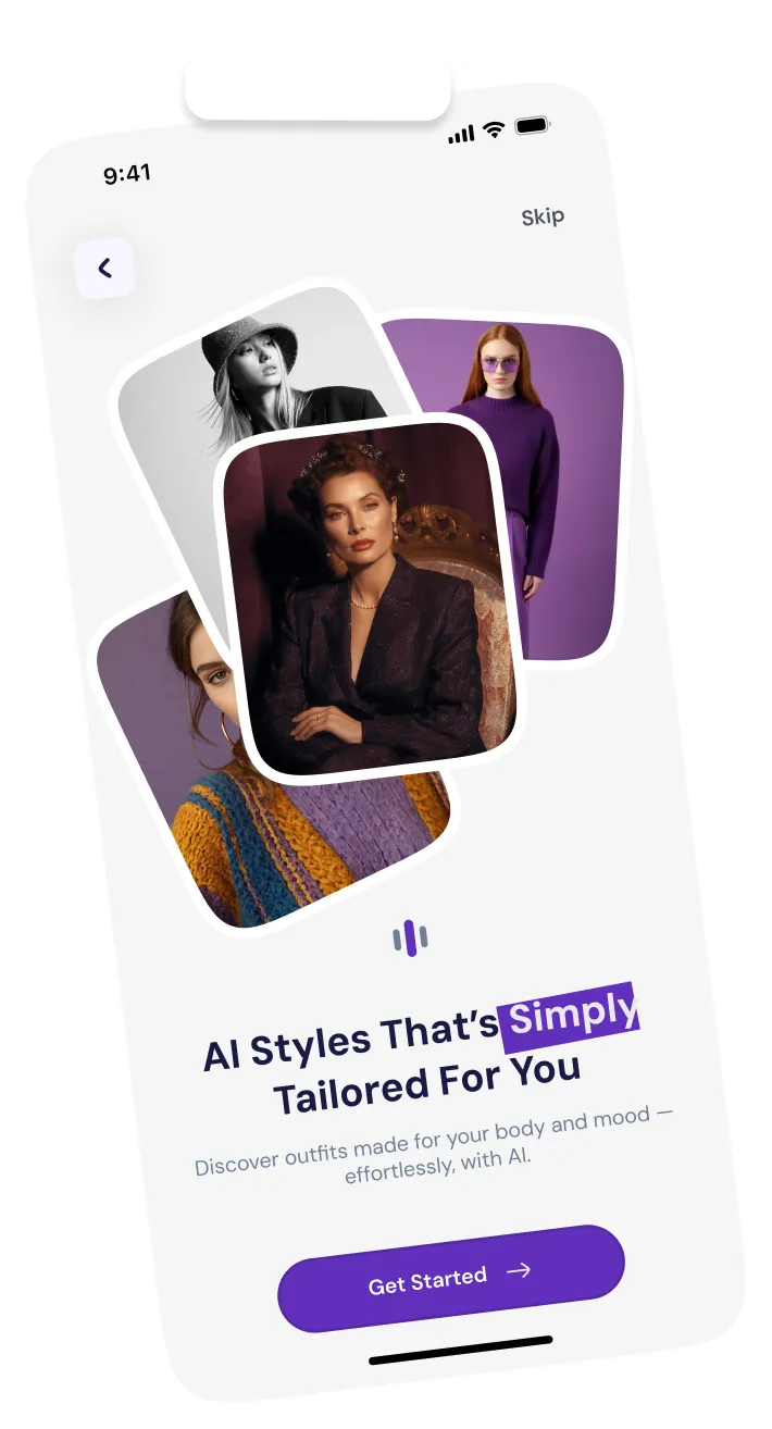
Solo project, Oct–Nov 2025. Research: 24% dislike returns, 20% don’t know their body type.
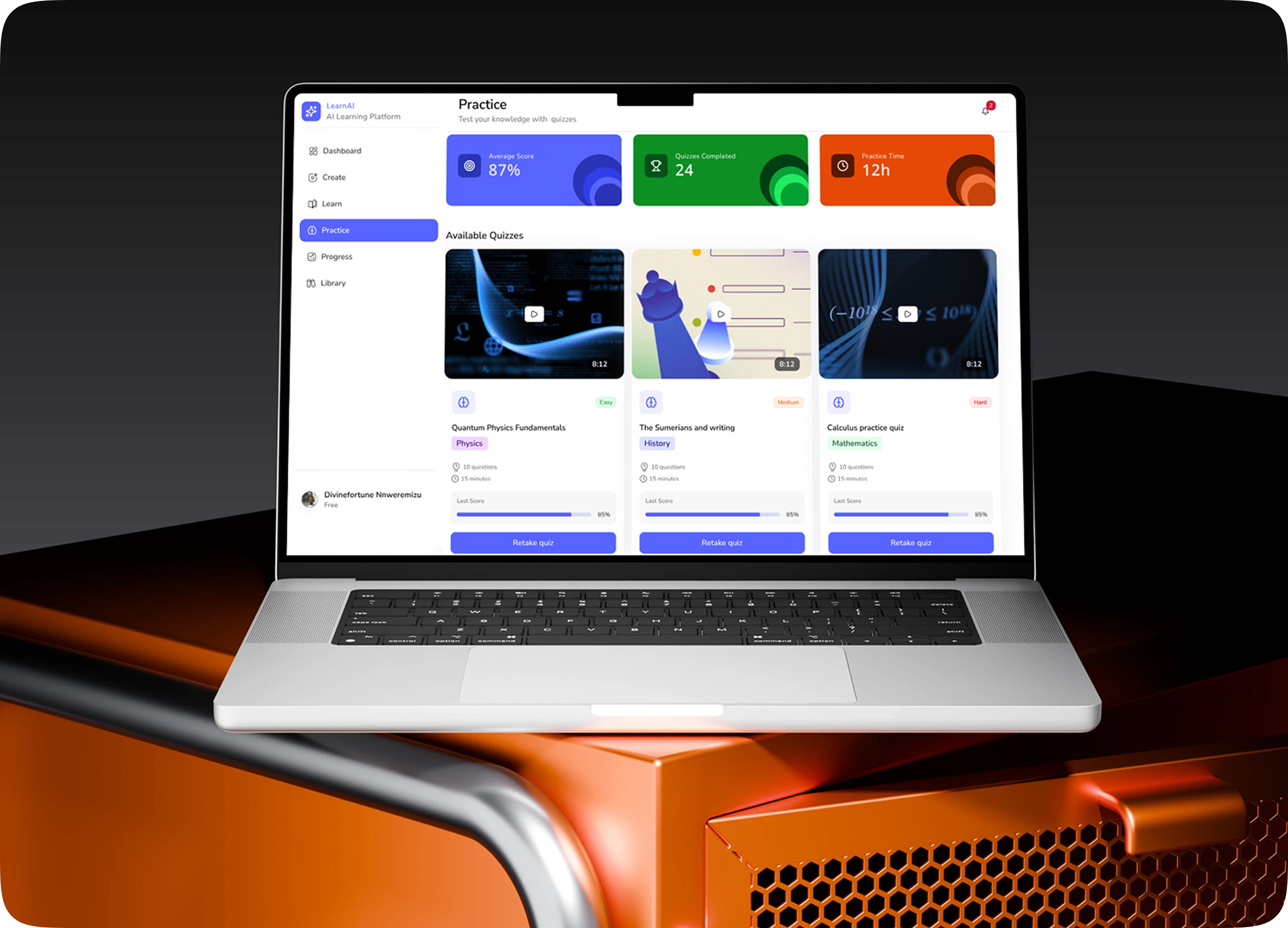
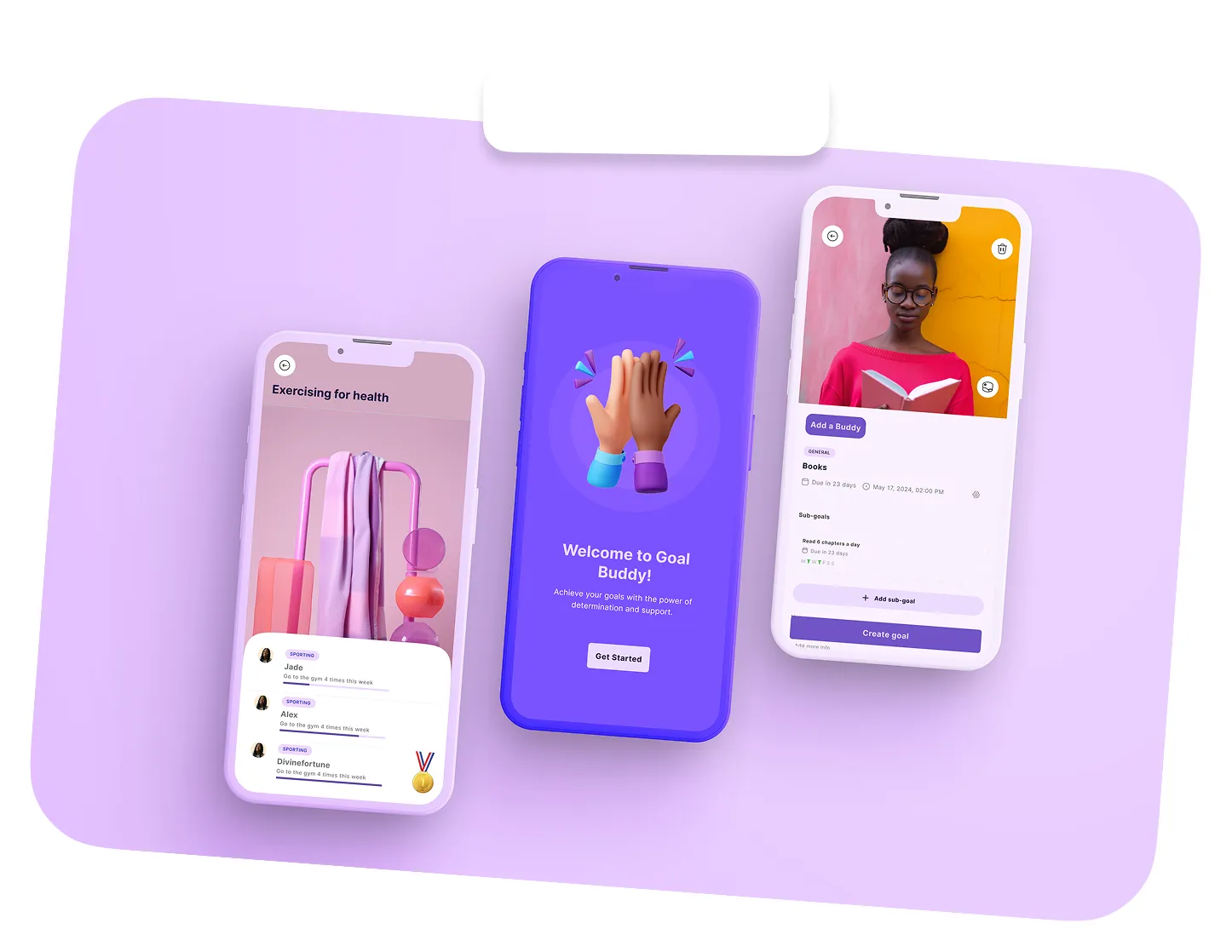
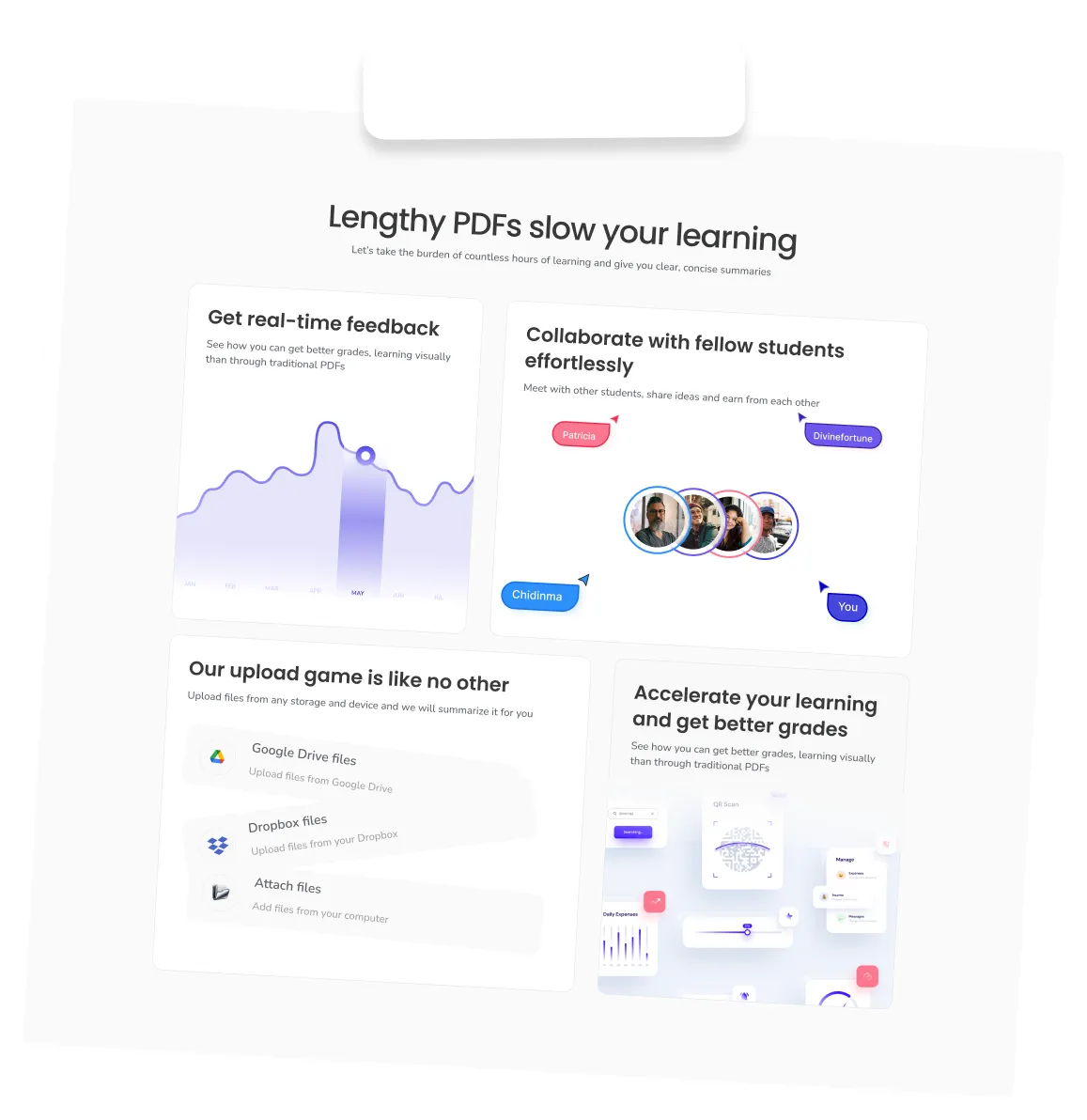
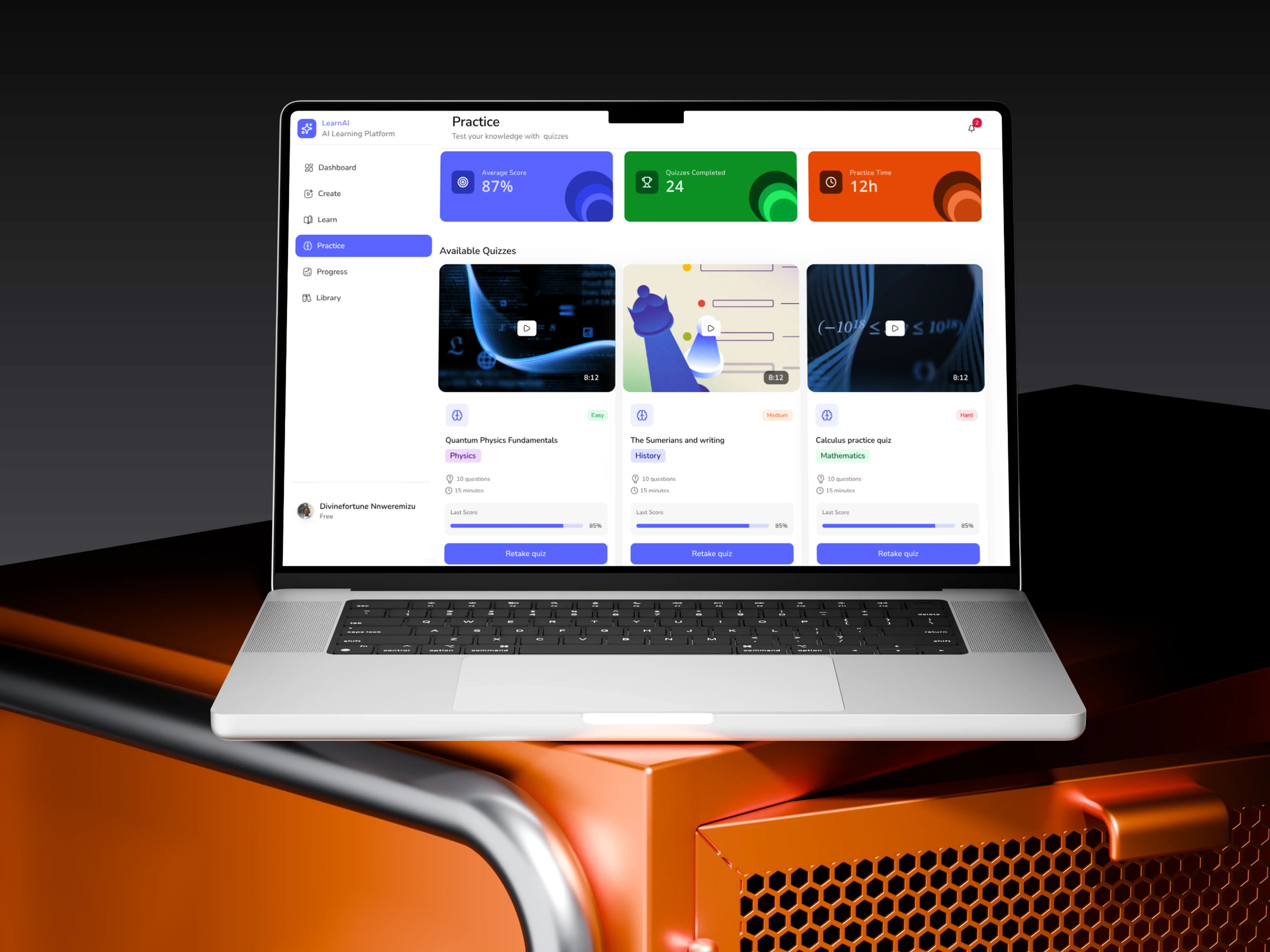
Solo project, Oct–Nov 2025. Upload any study material, get a short video and a quiz.
Here, ideas are explored, challenged and tested to go from rough thinking to clear direction. From flows, edge cases, early structures, to constraints and possibilities, they all happen here.
Who doesn't like a designer with a developer mindset?
I move from design thinking in Figma through HTML, CSS, and JavaScript, learning frontend frameworks
while integrating AI into design workflows with empathy for developers and collaborate smoothly across
cross-functional teams.
A lot of people can build products. Very few can clearly explain why those products should exist. I’m intentional about my work, I don’t design anything unless I can justify the real need behind it.
Everyone experiences the world differently. We all see, think, and perceive things in our own way. As a designer, my responsibility is to represent those differences, and to speak up for users in the decisions that shape their experiences while building the business goals.
It wasn’t until I started writing and reflecting deeply especially on Medium, about how design influences behavior and perception that I truly grasped the power visuals hold. That realization shaped how I see my role as a designer: not just to make things look good, but to be intentional, responsible, and aware of how every design choice can influence how people think, feel, and interact with the world.
I worked with Divinefortune on a client’s AI-powered beauty web app project, and the experience was very smooth. She was reliable, communicative, and paid close attention to detail throughout the project. The platform involved beauty analysis, personalised makeup recommendations, and user-focused web app flows, and Divinefortune handled her responsibilities with professionalism and creativity.
She was proactive with feedback, easy to collaborate with, and always willing to improve the final outcome. I’d definitely recommend her to anyone looking for someone dedicated and pleasant to work with.
I worked with Divinefortune on several projects, including an AI-powered dental web application that detects dental issues and recommends available dentists, and she consistently proved to be an exceptional team member.
She was highly proactive, brought innovative ideas to the table, and played a key role in keeping the team motivated and on track to meet deadlines ahead of schedule. Divinefortune took ownership of her responsibilities, maintained high standards, and wasn’t afraid to hold the team accountable when needed to ensure we delivered our best work.
She’s reliable, collaborative, and genuinely committed to achieving great results, and I’d confidently recommend her to any team or organization.

I’m a product designer who’s spent the past few years building and shipping products across startups, freelance projects, and growing teams. I didn’t start in design straight away, I came in from a background that trained me to think structurally and intentionally, and that still shows in how I approach problems today. I naturally zoom out to understand the whole system, then zoom back in to shape the details that make it work.
A lot of my growth has come from working independently. I’ve taken projects from idea to execution on my own, which pushed me to learn motion, product design, and how to take real ownership of outcomes. That experience made me both self-driven and comfortable making decisions, while still being thoughtful about trade-offs.
I’m deeply curious by nature. I enjoy sitting with complex problems, asking “why” until things make sense, and designing solutions that feel both logical and human. I’m always learning, whether that’s exploring new tools, refining my thinking, or challenging my own assumptions.
I’ve collaborated with people across different countries and cultures, and that’s shaped how I communicate and work with teams. I value spaces where people feel safe to speak up, and I tend to communicate openly and clearly to keep everyone aligned.
Case study · Web app
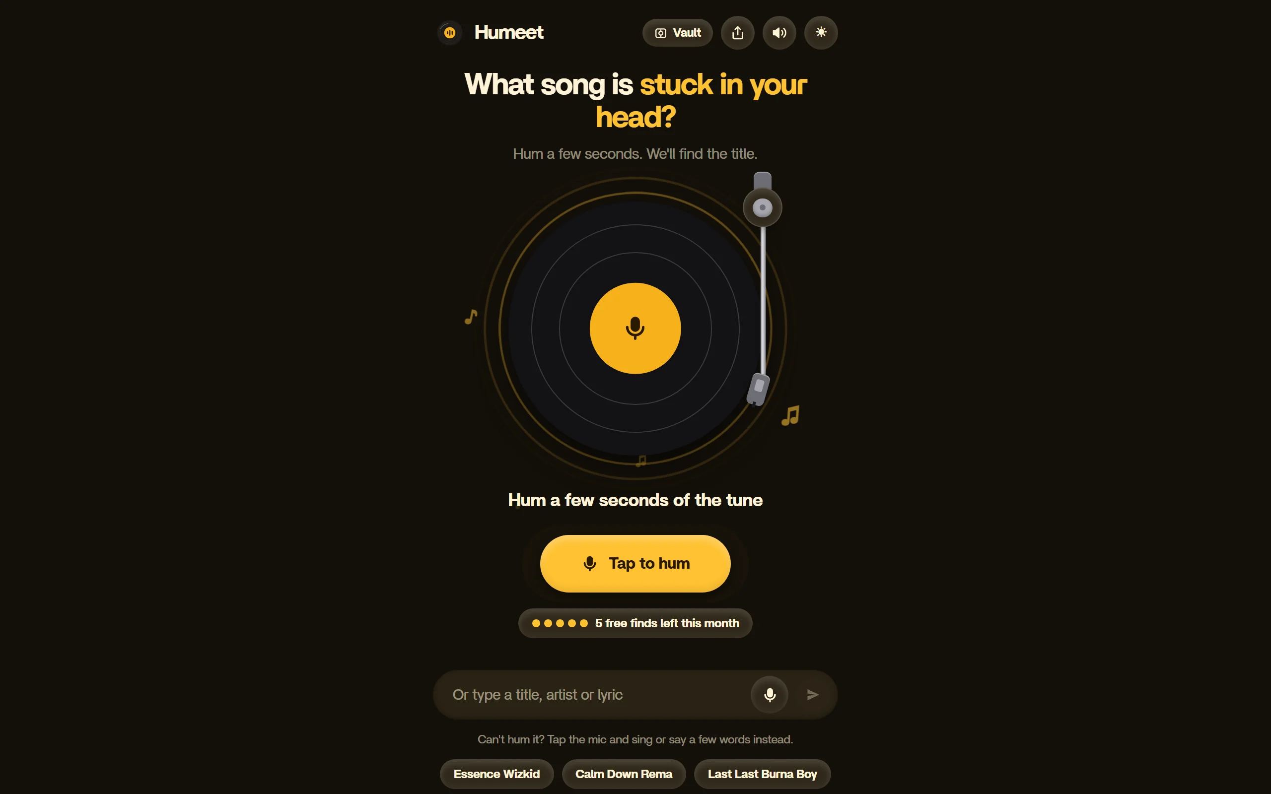
You know the tune, not the name. Humeet finds the song from a few seconds of humming, on any phone or desktop browser.
 Solo, designed and built by me
Launch video
Landscape for desktop, portrait for phones and social. Both cuts end on the live link.
Humeet is a web app that names a song from a few seconds of humming. Open it, tap the record, hum the chorus, and it returns the title and artist. It is free to try, with 5 free finds a month.
You know the tune. You do not know the name. Search engines and music apps ask for words you do not have, so the one thing you remember is the one thing you cannot type.
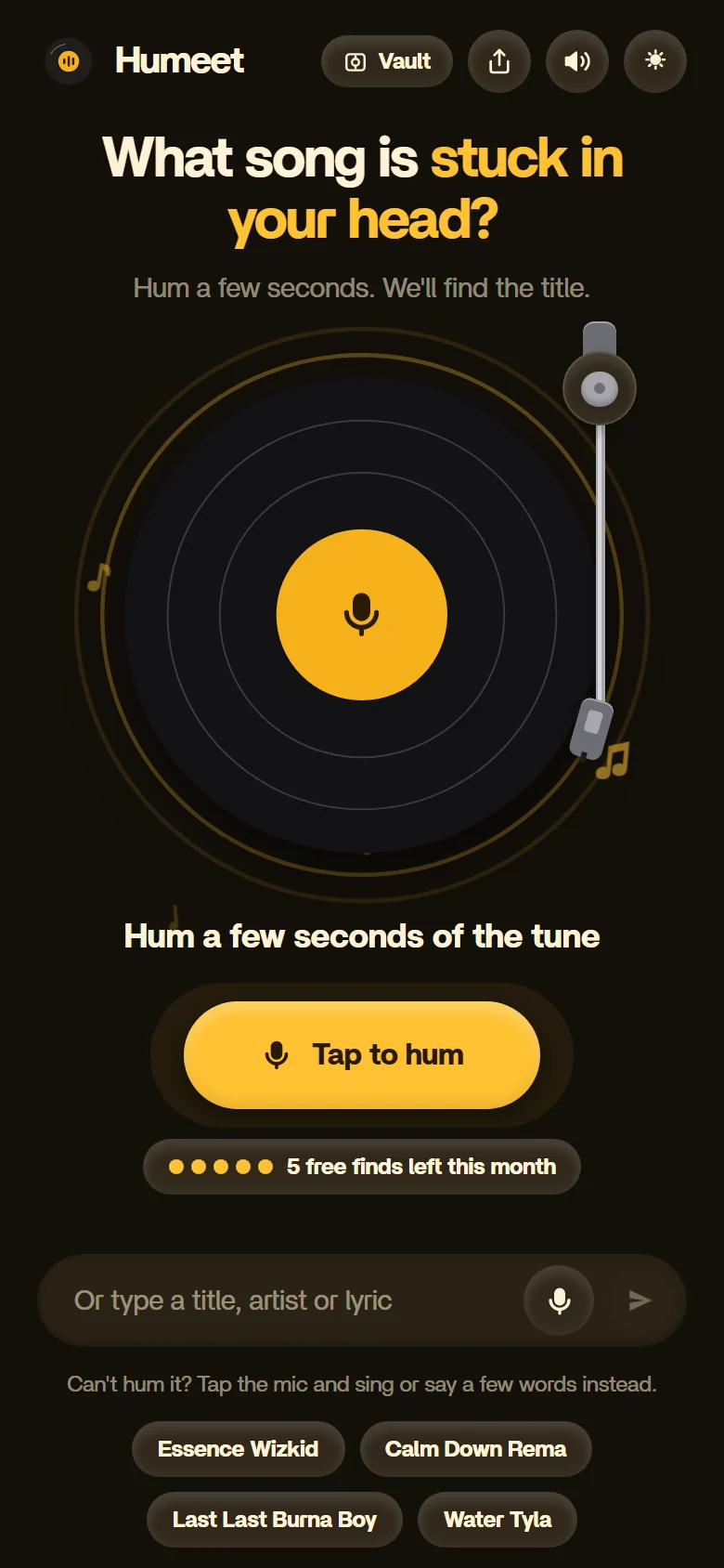
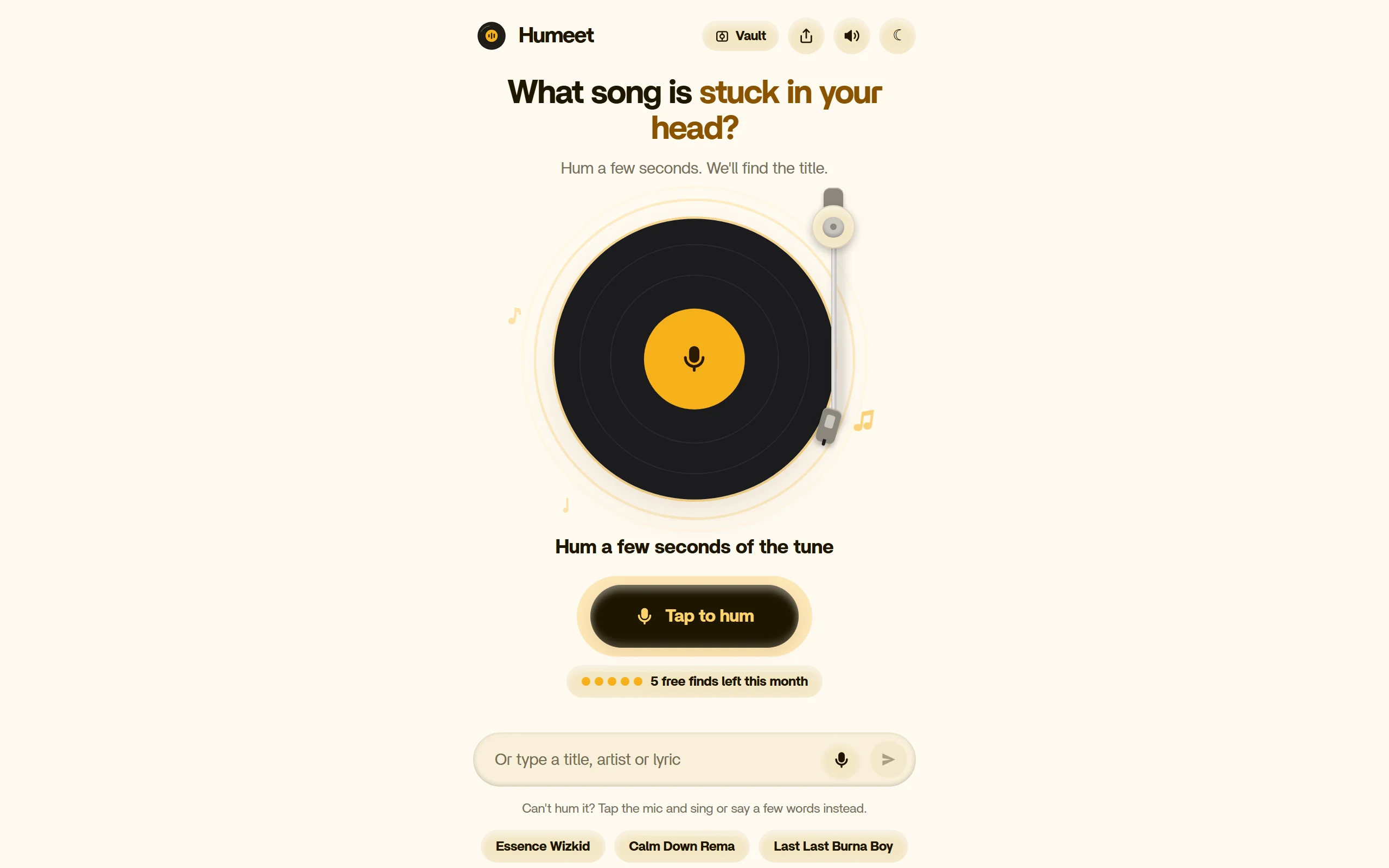
One screen, one action. A vinyl record sits in the middle with a mic on the label. Tap it, hum, and Humeet shows its best match as a record sleeve. If humming is not an option, you can type a title, artist or lyric, or tap the mic and sing or say a few words.
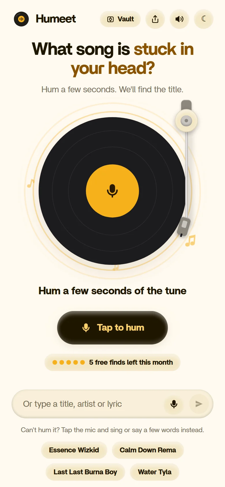
The record is the whole screen. One round button, “Tap to hum”, sits under it, and a counter shows how many free finds are left this month. Typing a title, artist or lyric is there as a quiet second option, with quick examples to try.
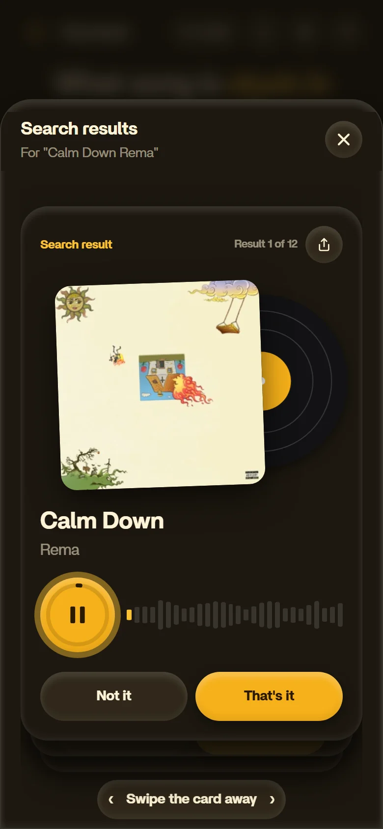
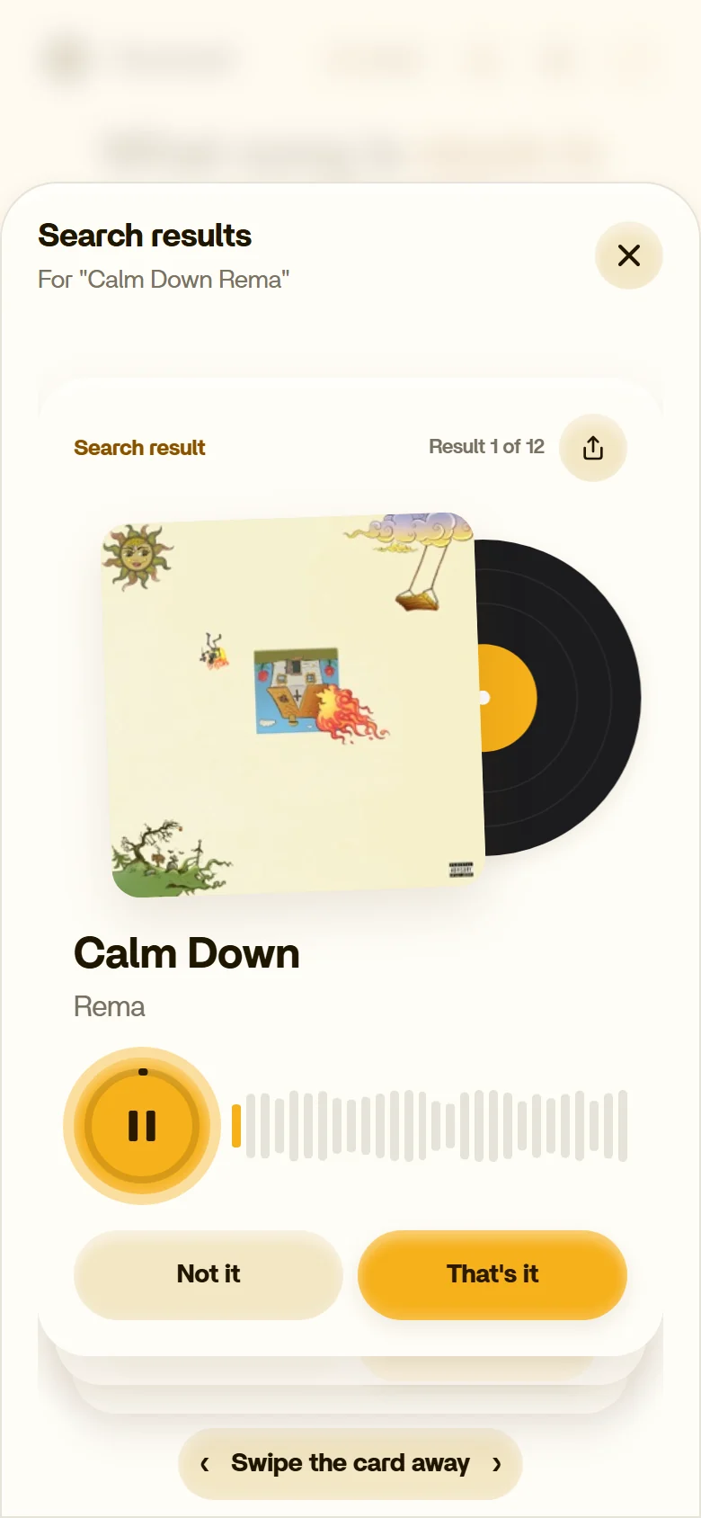
The match arrives as a record sleeve with the vinyl sliding out behind it, plus a preview you can play. Two buttons decide what happens next: Not it moves on, That's it confirms and unlocks Open in Spotify, Apple Music and Share. A counter shows where you are in the stack.
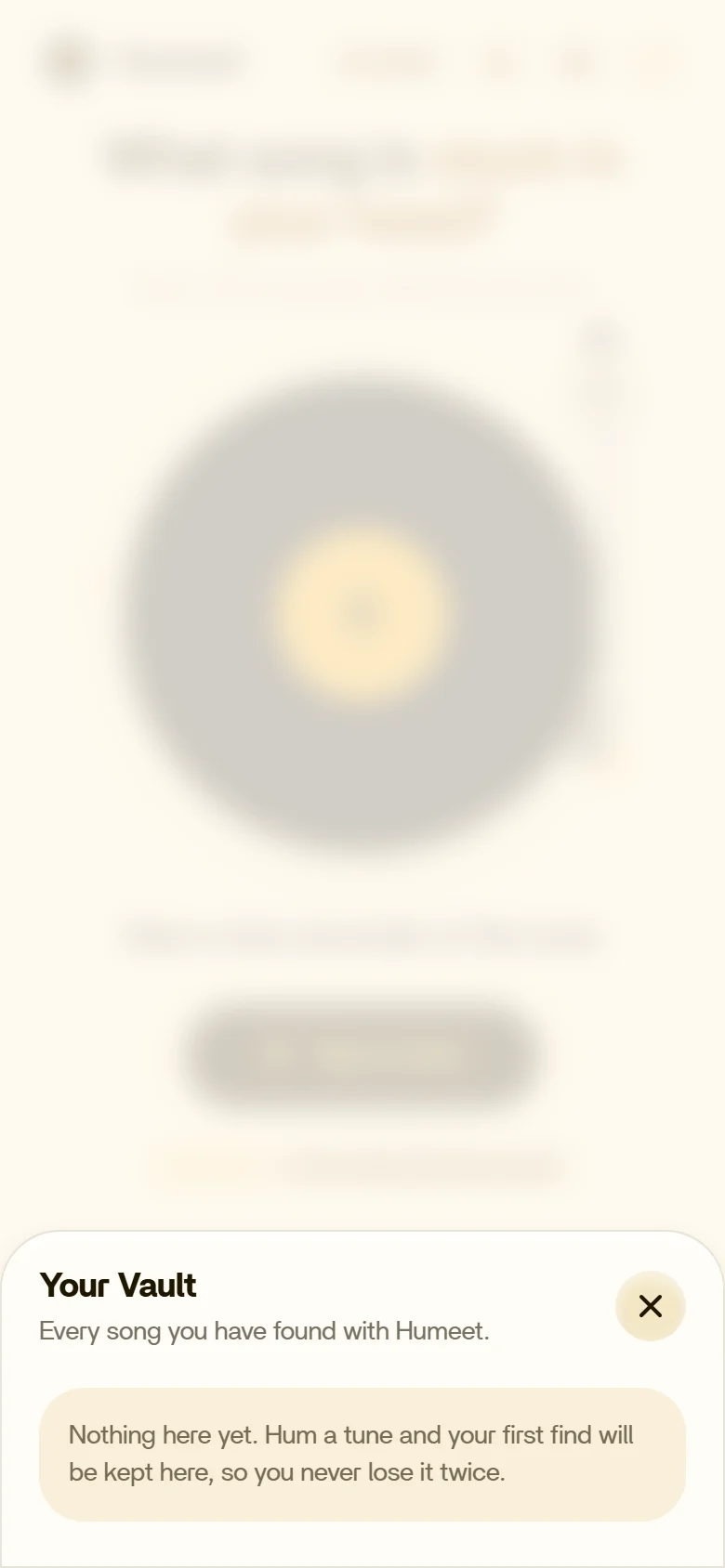
Empty
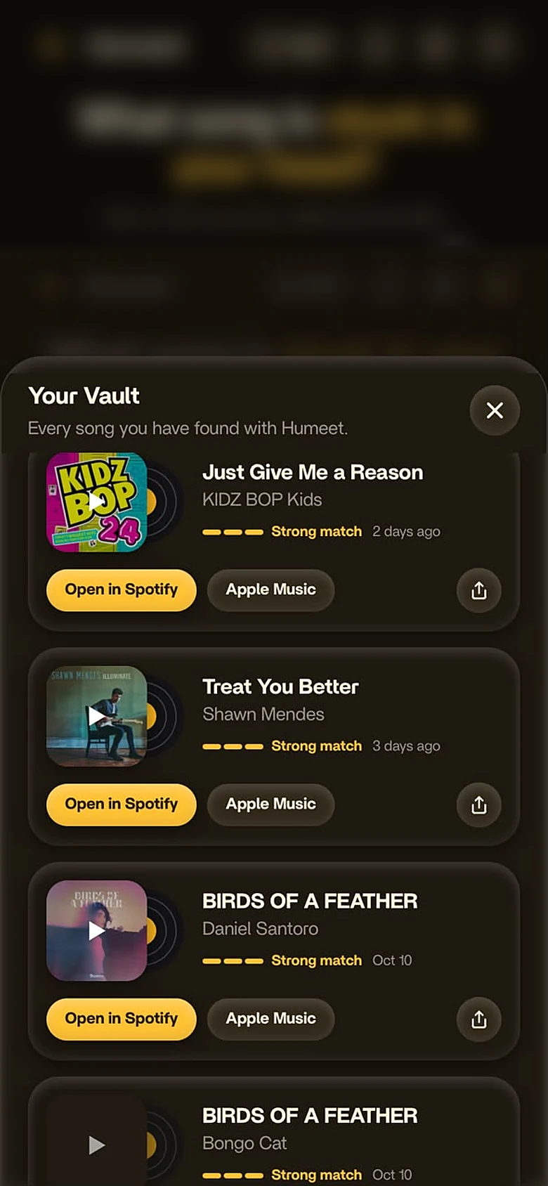
With finds
Every song you have found with Humeet is kept here. Each find shows the cover, title and artist, a match-strength meter, when you found it, and one-tap Open in Spotify, Apple Music or Share. Before your first find, the empty state makes the promise in one line: “so you never lose it twice.”
The same single-column layout holds on a wide screen, so the record stays the focus.
Outcome
Built and launched solo in two weeks. Here is how launch went.
Source: Vercel Analytics, production, last 30 days to 25 Oct 2026.
Humeet takes the one thing you remember about a song and turns it into the one thing you were missing. Open it on your phone and hum the first tune that comes to mind.
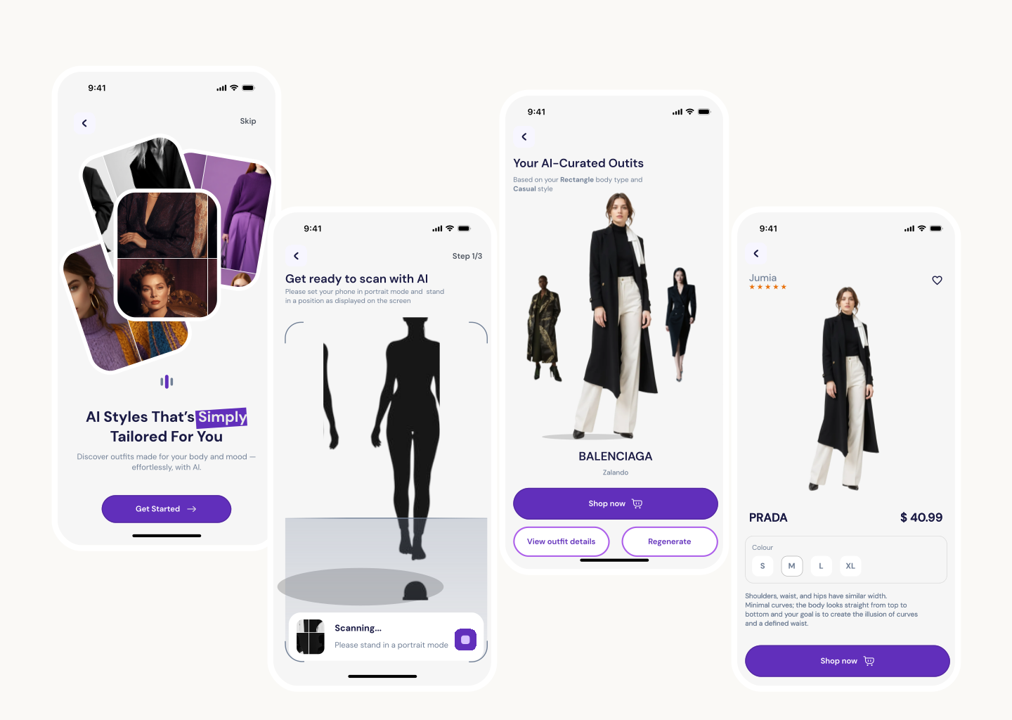
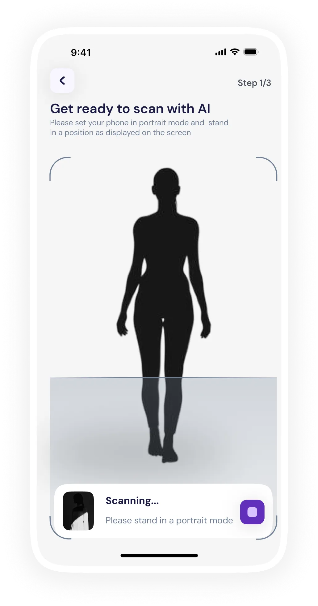
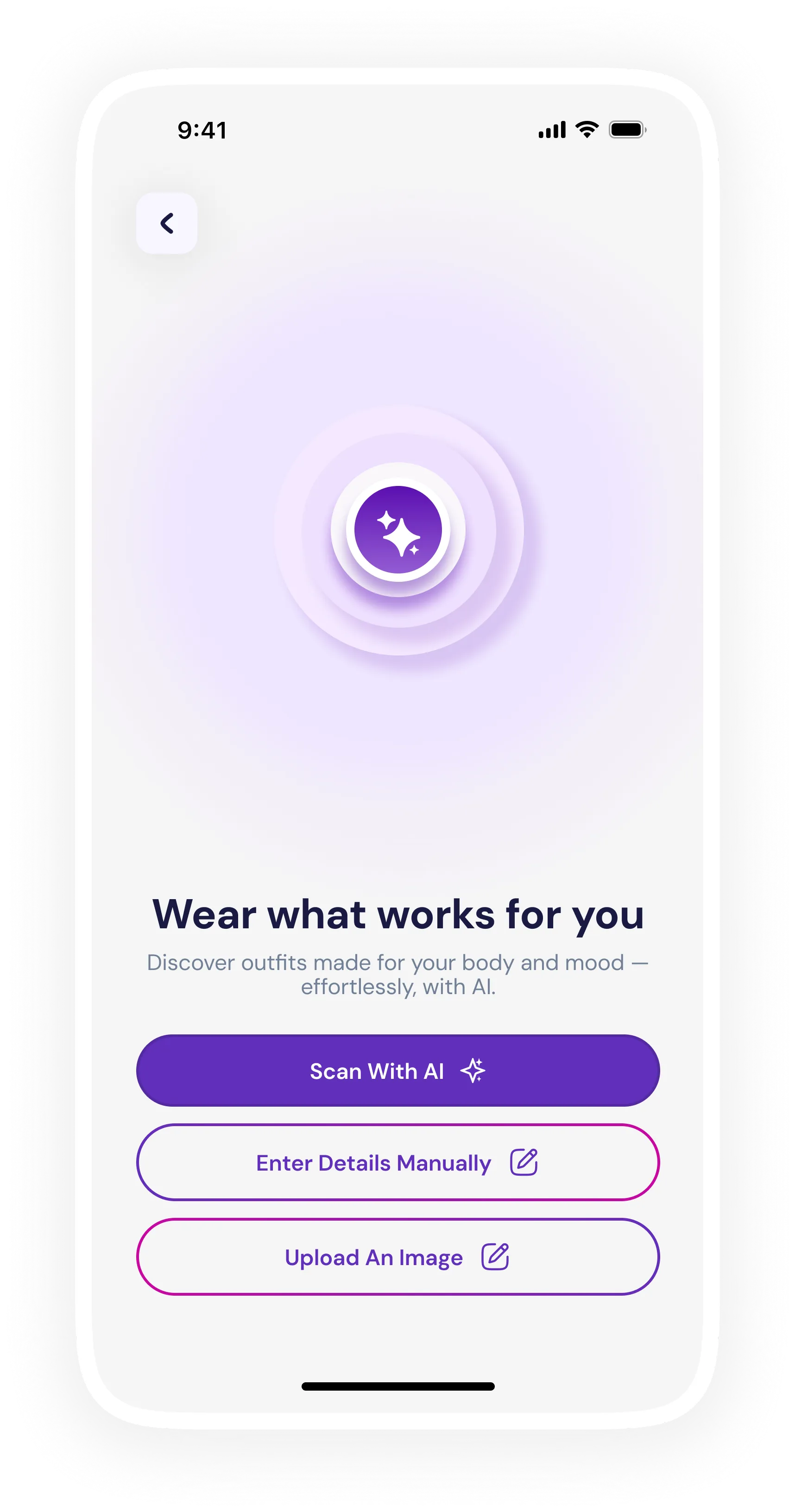
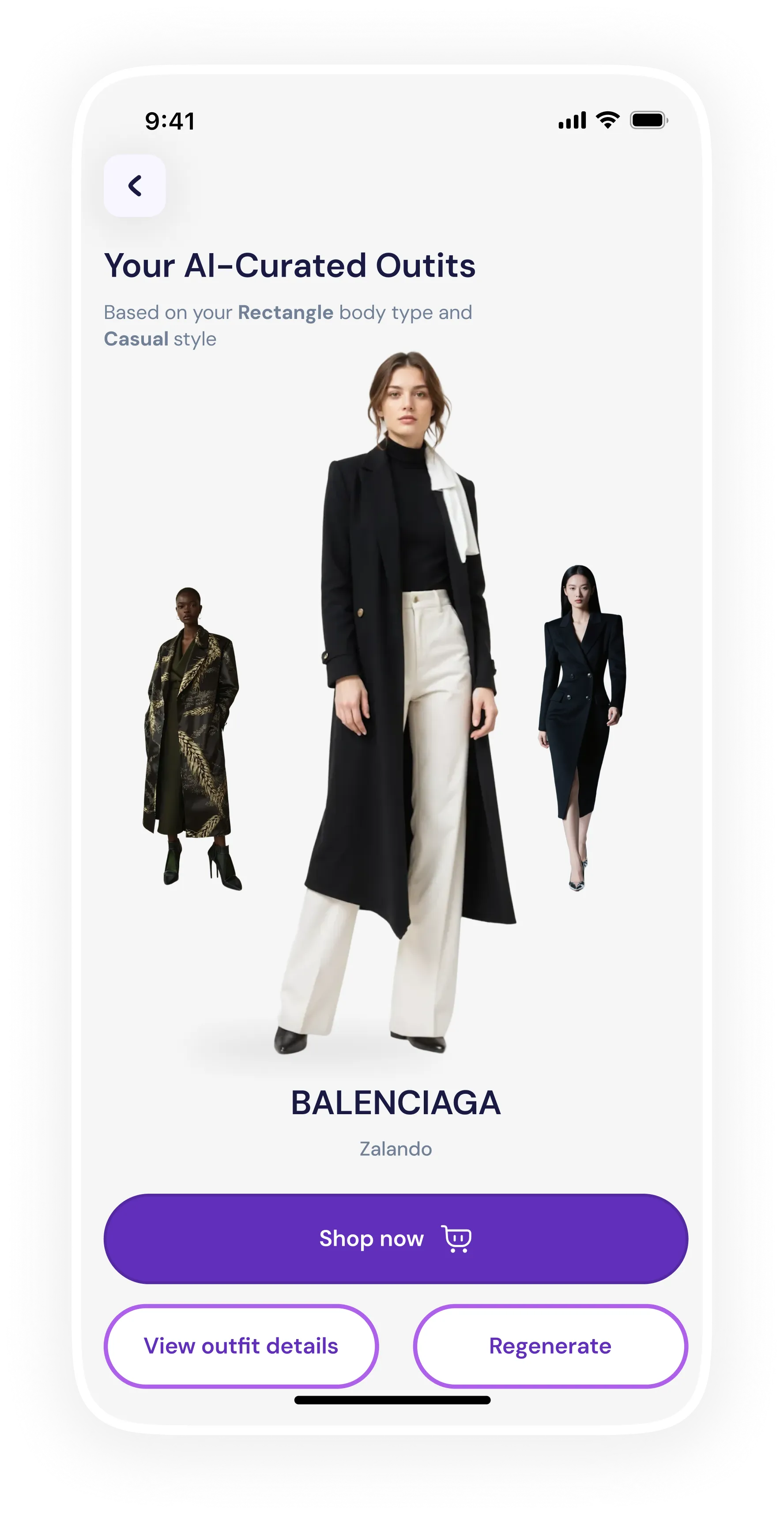
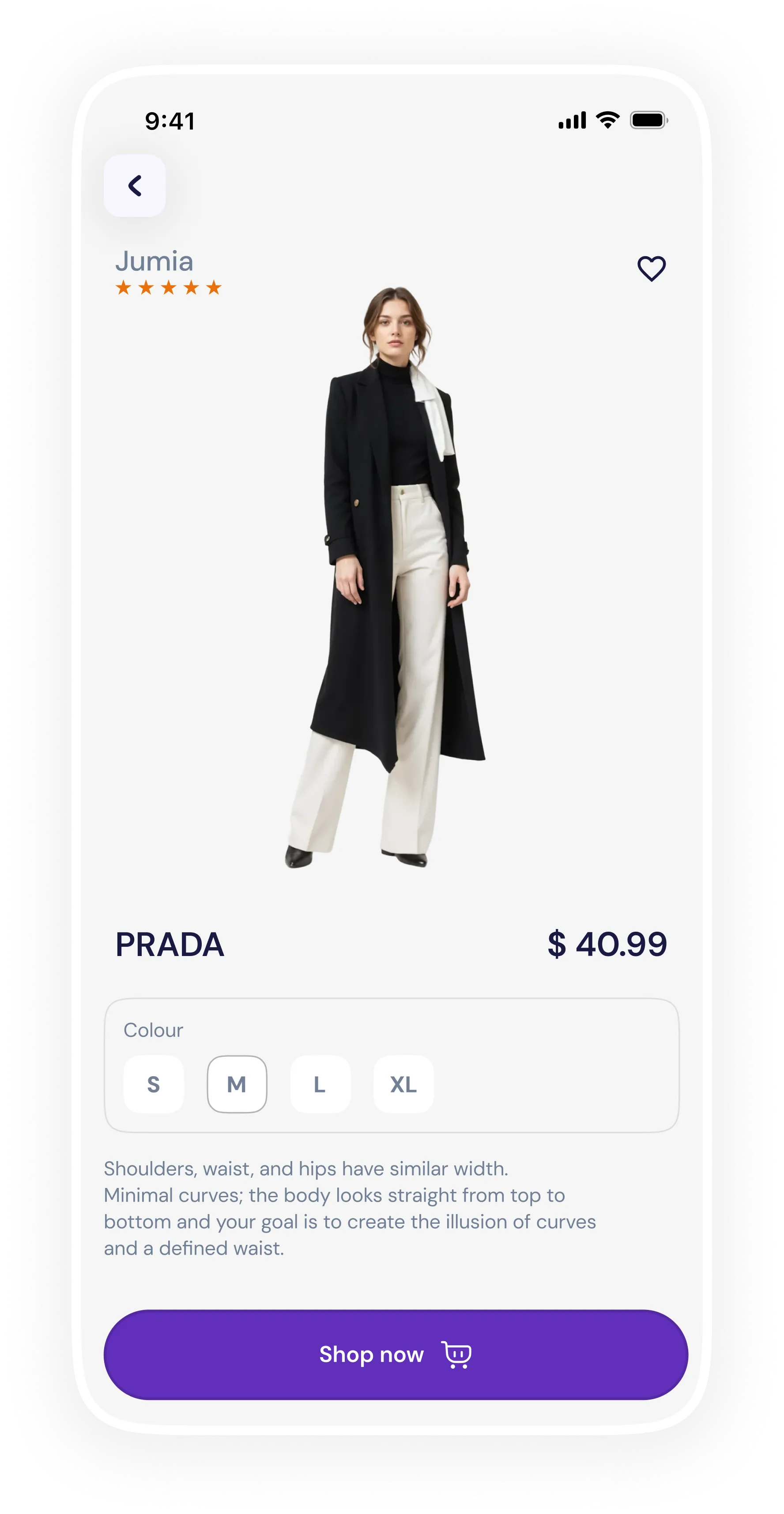
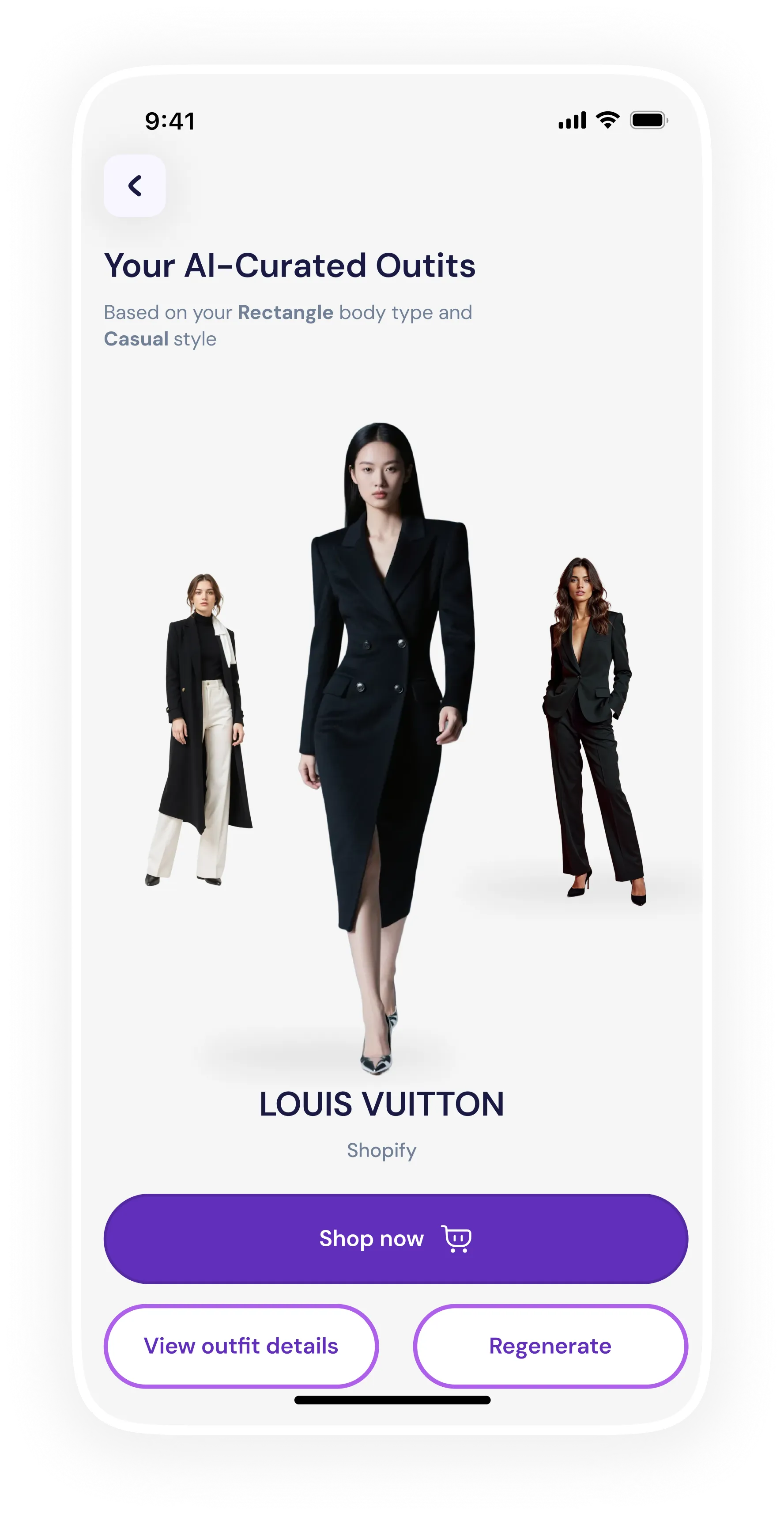
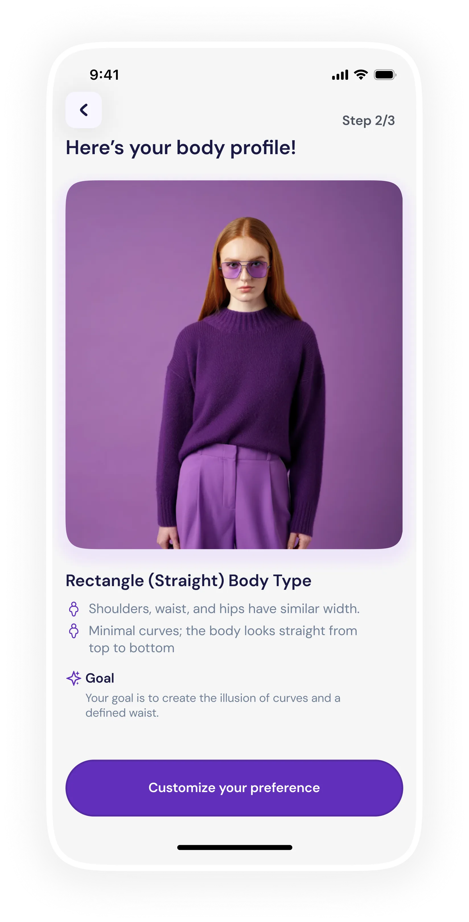
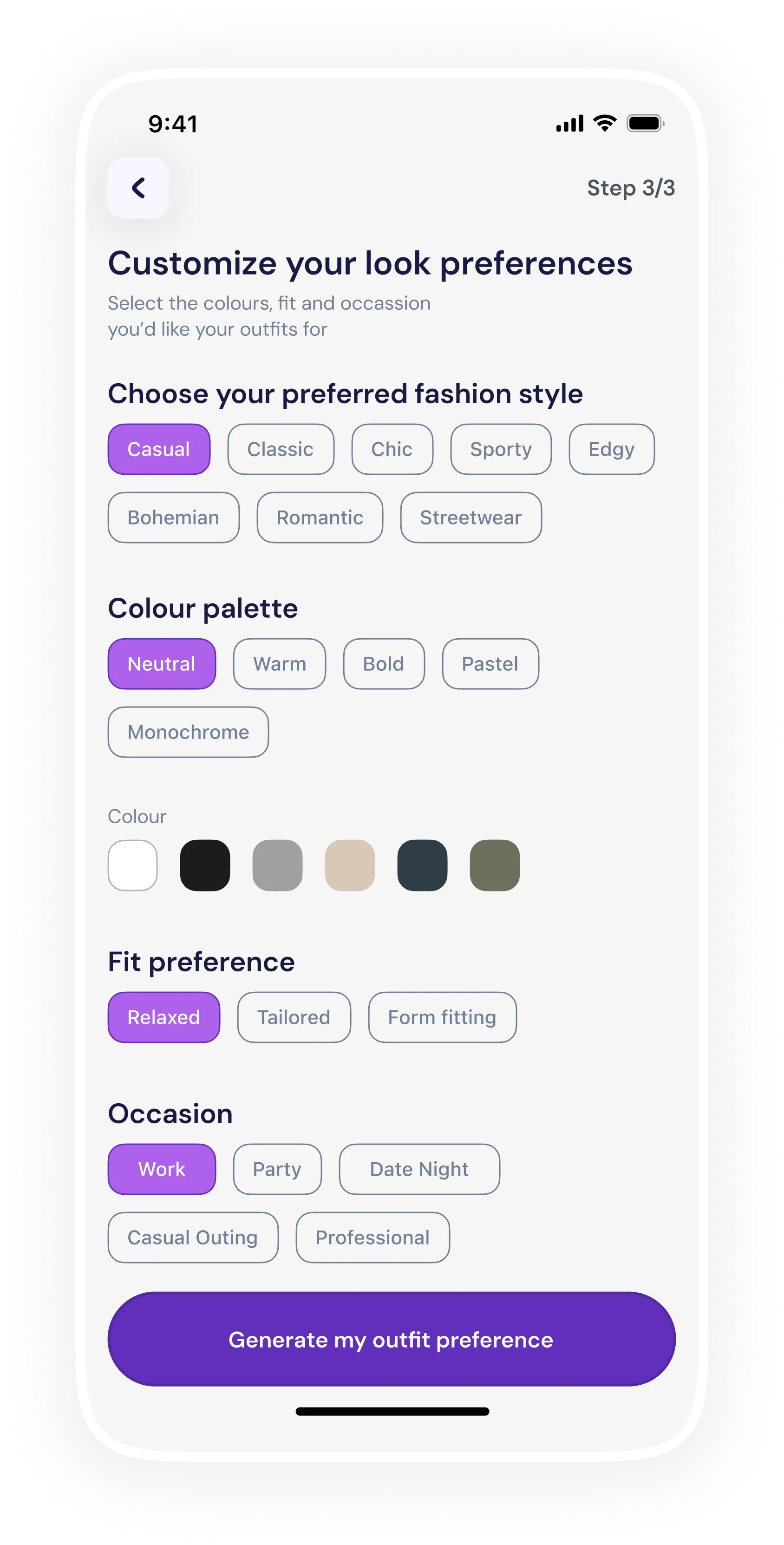
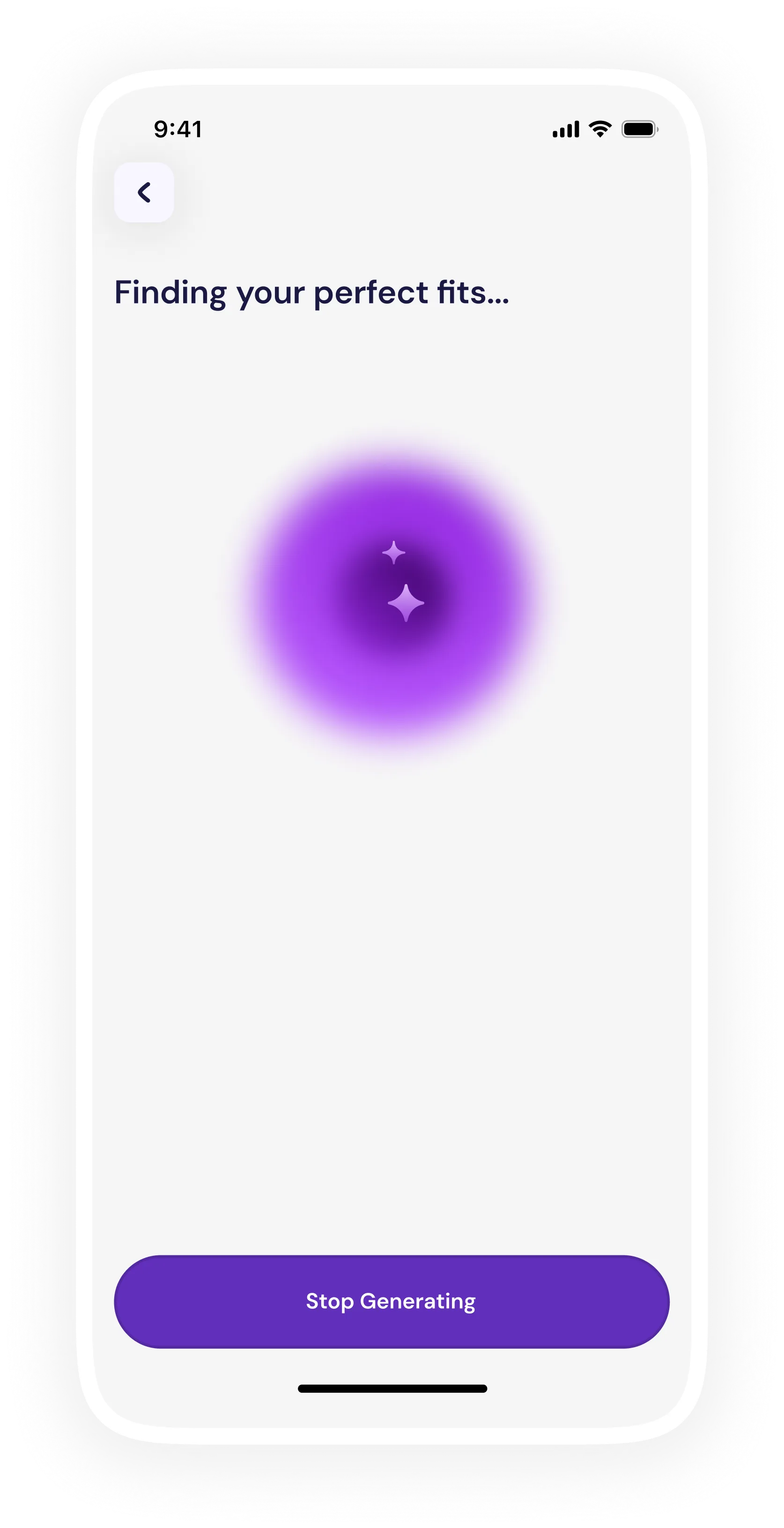
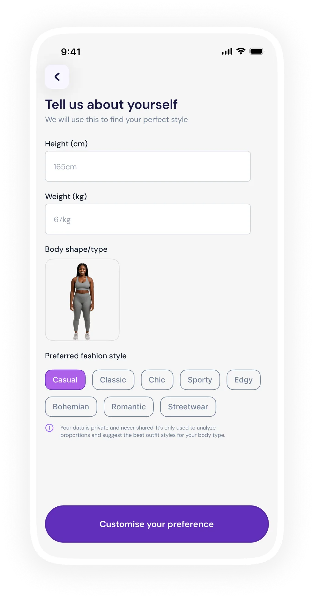
Online shopping makes it hard to know if clothes will actually flatter your body, leading to poor fit, low confidence, and high returns, and existing style apps only make generic, trend-based suggestions rather than ones tailored to your shape. I saw an opportunity to build an AI-powered app that recommends outfits based on a user’s actual proportions, style, and color preferences.
Scope
Product Design · Mentorship · UX Research
Fit, reimagined for every body.
Create a user-centered mobile app that empowers individuals to find clothing that fits their body, boosting confidence, reducing guesswork, and making online fashion more inclusive.
Design Approach
Testing · Prototyping · Secondary Research
To validate the idea and better understand user needs, I began with the following and these insights shaped the app’s core design principles: inclusive, user-friendly, optional, empowering, and data-driven.
Talking to people about their pain with online shopping: “clothes look good on the model but not on me,” “returns are annoying,” “I wish I knew what suits my shape.”
Evaluating existing fashion apps and style services; noting gaps: lack of body-type personalization, limited inclusivity, poor guidance.
Studying common body shape classifications (Hourglass, Pear, Rectangle, Inverted Triangle, Apple, Diamond, Oval) and which clothing silhouettes tend to flatter each type.
wants a flexible experience that lets users choose between AI-scan, photo upload, or manual entry increases trust & accessibility.
dislike returns and want to make confident purchases.
often don’t know their “body type” or what styles suit them.
From research, I derived the following functional requirements for the app:
Not every user is comfortable with the same level of technology or exposure. To reduce friction and increase adoption, the app offers three distinct ways to get started, allowing users to choose what feels safest and easiest for them.
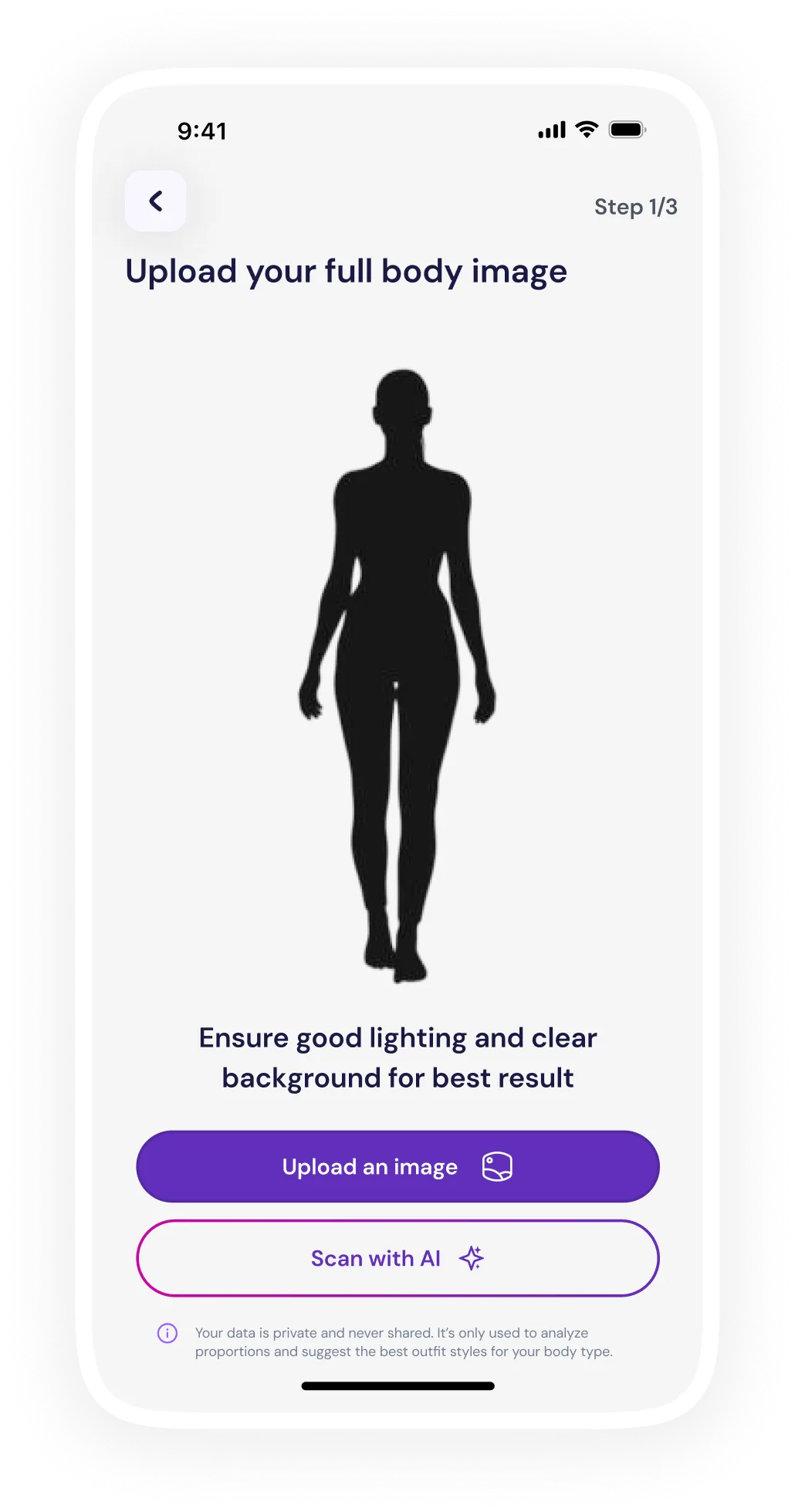
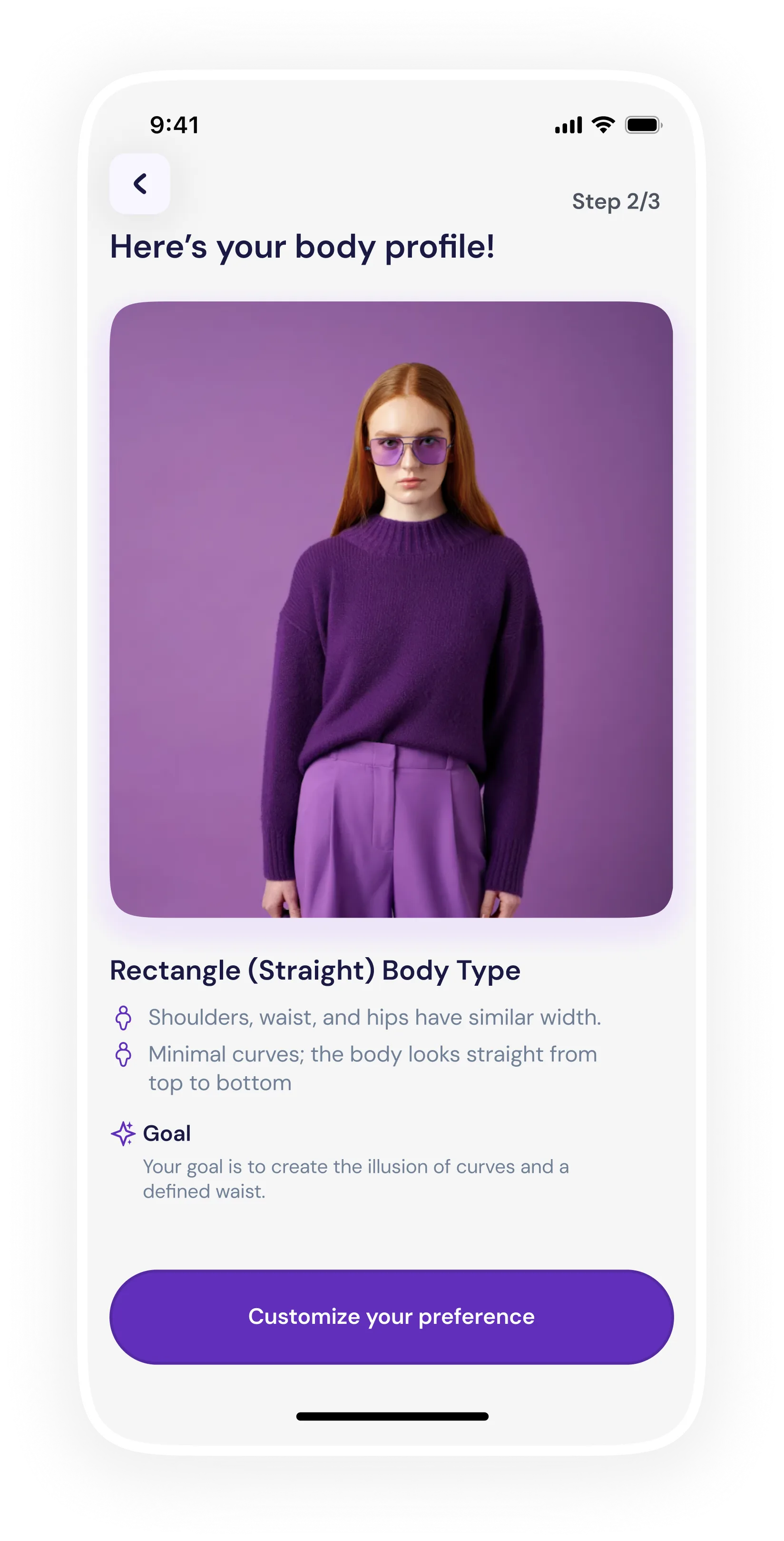
Once input is provided (via scan, upload, or manual entry), the app generates a Body Profile that becomes the foundation for all recommendations. The AI analyses Shoulder-to-hip ratio, Waist definition, Overall body proportions, Height-to-width balance. The output is one of the 7 body types (Hourglass, Pear, Apple, Rectangle, Inverted Triangle, Diamond, etc.), and supporting attributes such as proportion highlights (e.g., “broader shoulders,” “defined waist”).
Fit alone isn’t enough, personal style is just as important. After identifying body type, the app invites users to express their fashion identity which includes choosing a fashion style option, colour palette to choose from, fit preferences to choose from and the occasion for the outfit.
Outfits are recommended by combining the user’s body type profile with their selected style preferences, ensuring both fit and personal expression are respected. The system prioritizes silhouettes, cuts, and proportions that naturally complement the user’s body shape, while aligning fabrics, colors, and styling details with their chosen fashion style. This approach ensures recommendations don’t just look good on the user’s body, but also feel authentic to how they want to present themselves.
Users can explore recommended outfits in detail, viewing styling notes, fit guidance, and why each look works for their body type and preferences. They can save outfits to a personal collection for future reference or comparison, making it easy to build a curated wardrobe over time. For items they love, users can seamlessly shop the look through integrated links to partner stores or marketplaces, turning inspiration into action.
Graceful loading and feedback flows keep users informed and reassured while the app processes scans or generates recommendations. Clear progress indicators, microcopy, and subtle animations communicate what’s happening, how long it might take, and what to do next, reducing uncertainty and frustration. This transparency builds trust and makes the experience feel intentional, responsive, and user-centered rather than technical or confusing.
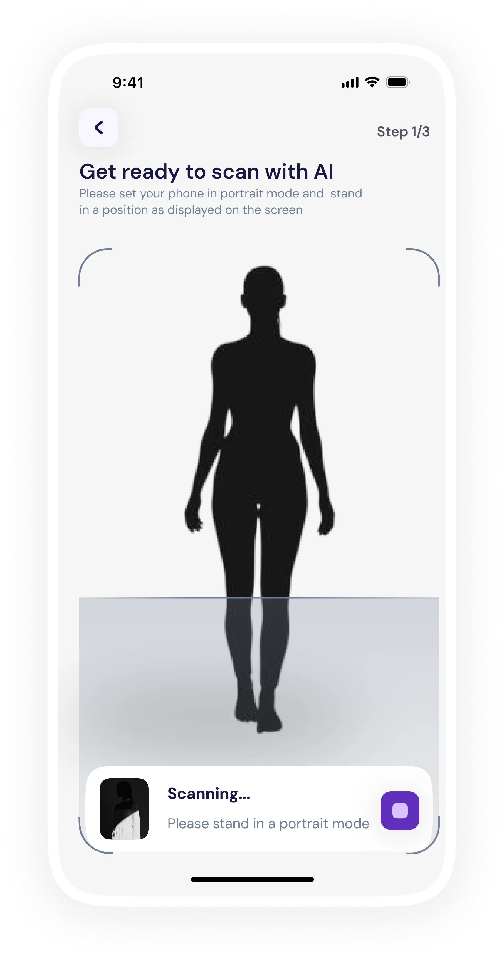
Once input is provided (via scan, upload, or manual entry), the app generates a Body Profile that becomes the foundation for all recommendations. The AI analyses Shoulder-to-hip ratio, Waist definition, Overall body proportions, Height-to-width balance. The output is one of the 7 body types (Hourglass, Pear, Apple, Rectangle, Inverted Triangle, Diamond, etc.), and supporting attributes such as proportion highlights (e.g., “broader shoulders,” “defined waist”)
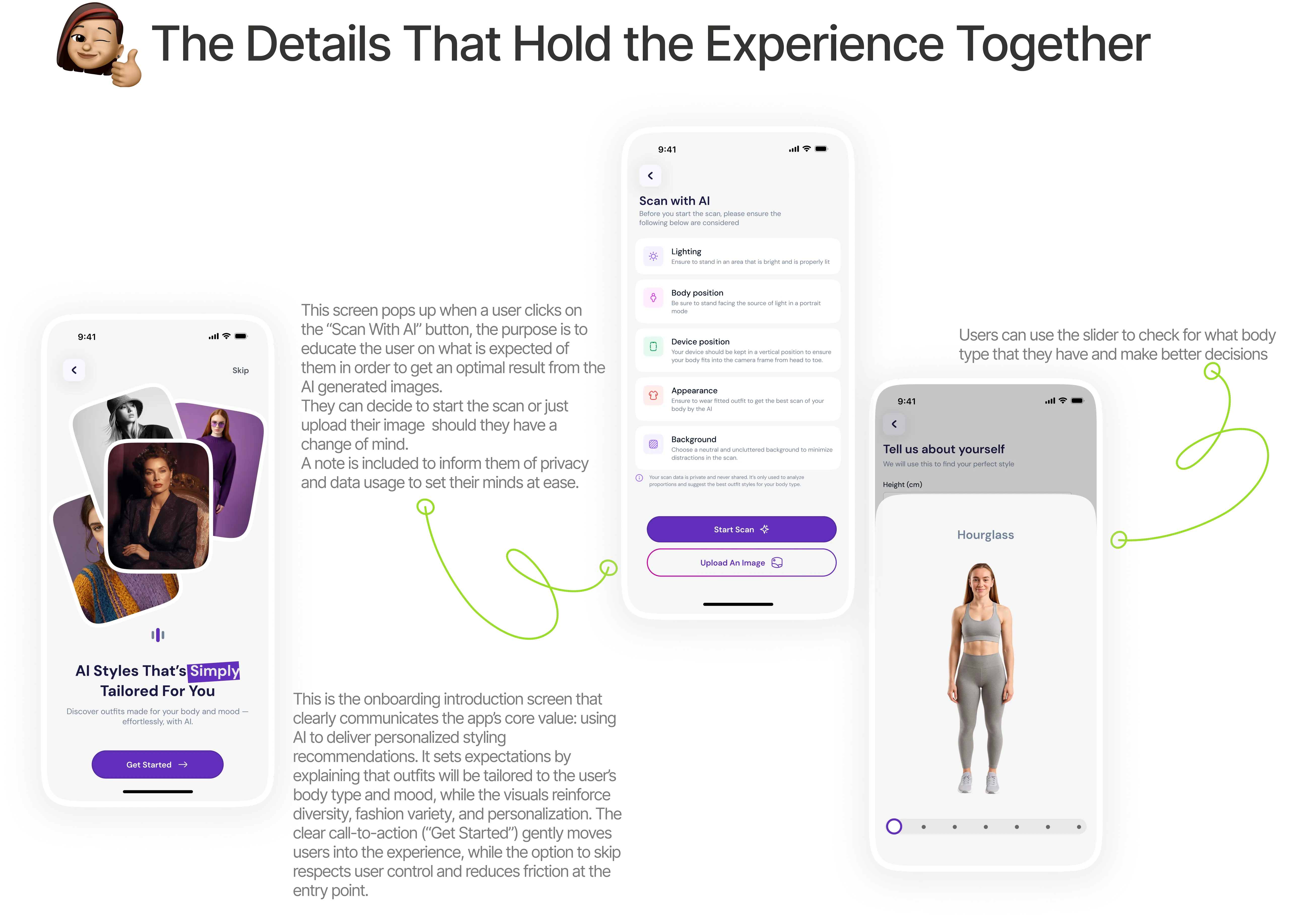
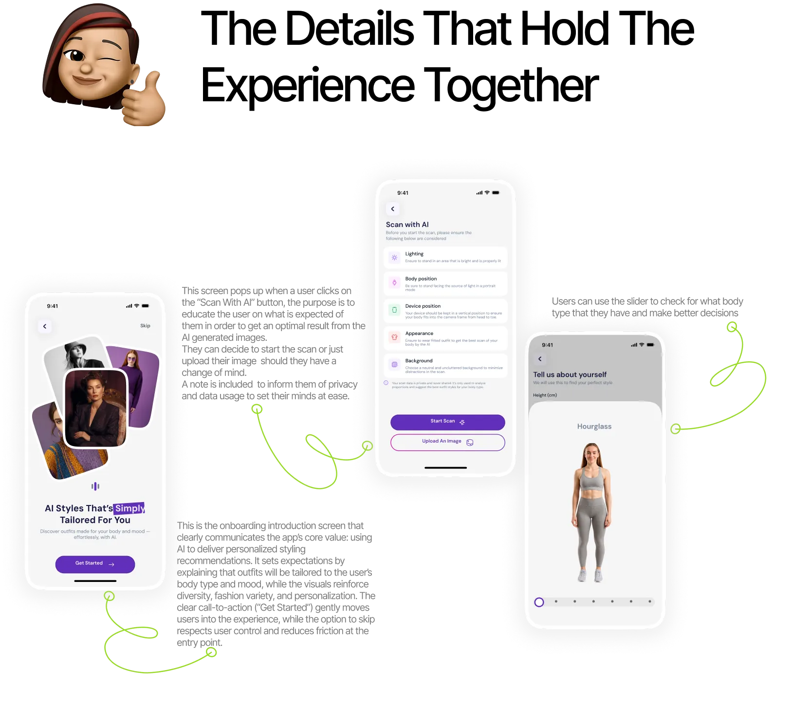
During design, I faced (and expect to face) several constraints. Some of them include the following:
Users vary widely in height, posture, clothing, camera quality, lighting. False positives or mismatches can undermine trust.
Users may hesitate to upload photos or scan their body; requires strong privacy messaging and transparent data handling.
Designing recommendations that meaningfully cover all body types, skin tones, and proportions without bias.
Generating tailored outfit suggestions requires access to a robust, inclusive catalog of garments in all sizes and styles.
Body scan, analysis, and recommendation generation must be fast enough to avoid user frustration.
Taste, budget, culture amongst others were hard to model perfectly within AI.
Building multiple input paths (AI scan, image upload, manual entry) reinforced the importance of inclusivity, comfort, and user control in sensitive experiences like body profiling.
I learned that simplifying flows by merging screens and reducing steps, significantly improves comprehension, confidence, and completion rates without sacrificing functionality.
Clear feedback states, graceful loading, and transparent explanations helped establish credibility in an AI-driven experience where users need reassurance.
Fit alone isn’t enough. Capturing style, colour palette, fit preference and occasion as separate, structured steps made recommendations feel personal instead of generic.
Revealing information in stages (scan → profile → preference → recommendation) kept users focused and reduced overwhelm while maintaining curiosity.
Most learning tools assume reading equals learning. A 30–50 page PDF, abstract concepts with no visual context, and no way to measure real understanding leave students lost.
For visual learners especially, dense text-based content creates cognitive overload, low retention, and frustration that leads to disengagement.
I've always learned best through diagrams, animations, and step-by-step visuals — yet most academic materials aren't designed that way.
“Why should students struggle to understand content when technology can help explain it better?”
Personal learning reflection as a visual learner
Conversations with students across different disciplines
Competitive analysis of learning platforms and EdTech tools
Review of learning science principles (visual learning, cognitive load)
Students want more clarity from study materials they have.
Visual explanations dramatically improve comprehension.
Testing without feedback doesn't help learning.
Students want to know what they don't understand and why.
LilyAI turns any study material into a guided, visual learning loop — from upload to insight.
Drop in a PDF, DOCX, image, or just describe a topic — LilyAI turns it into a ready-to-watch lesson in minutes.
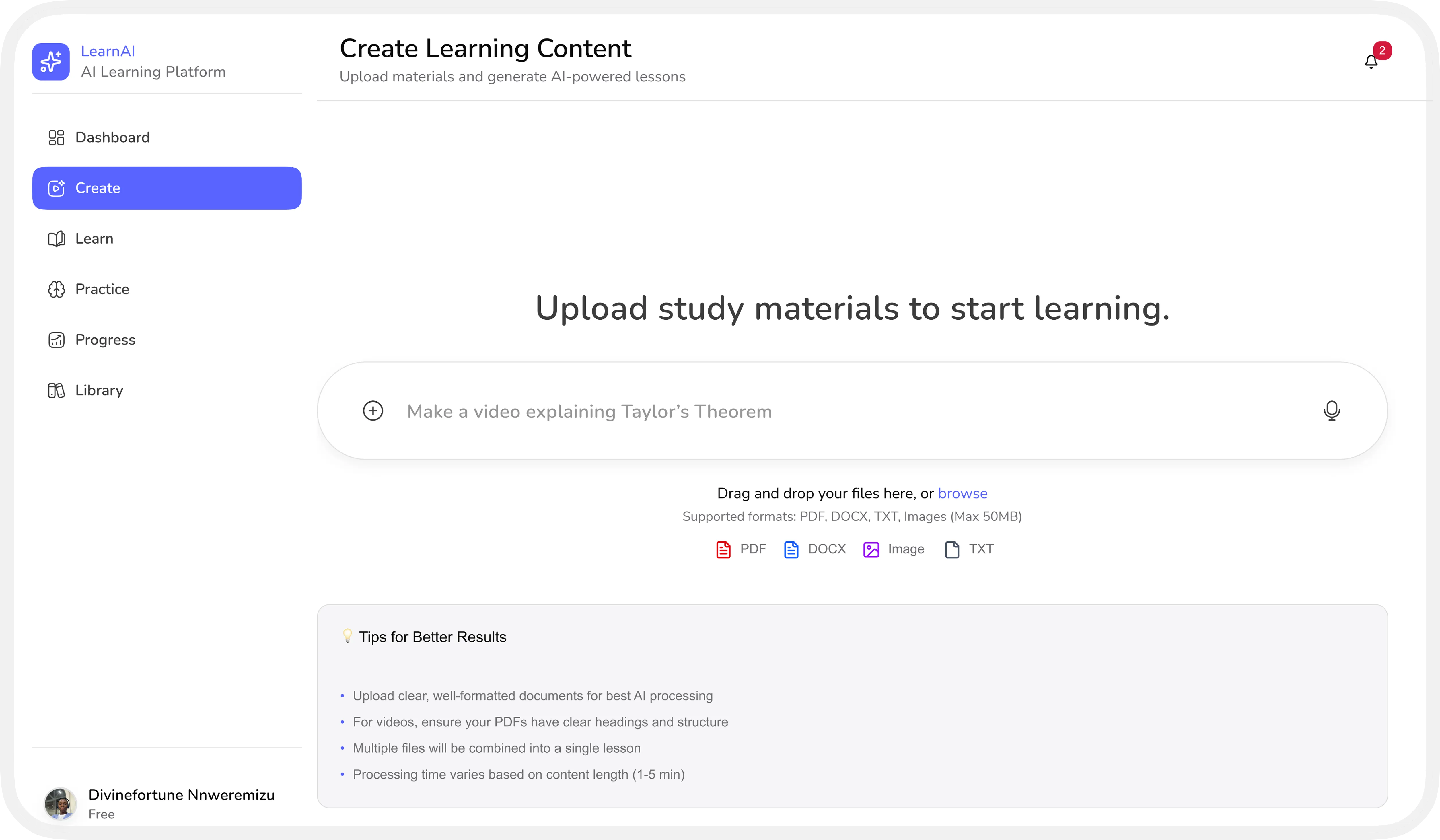
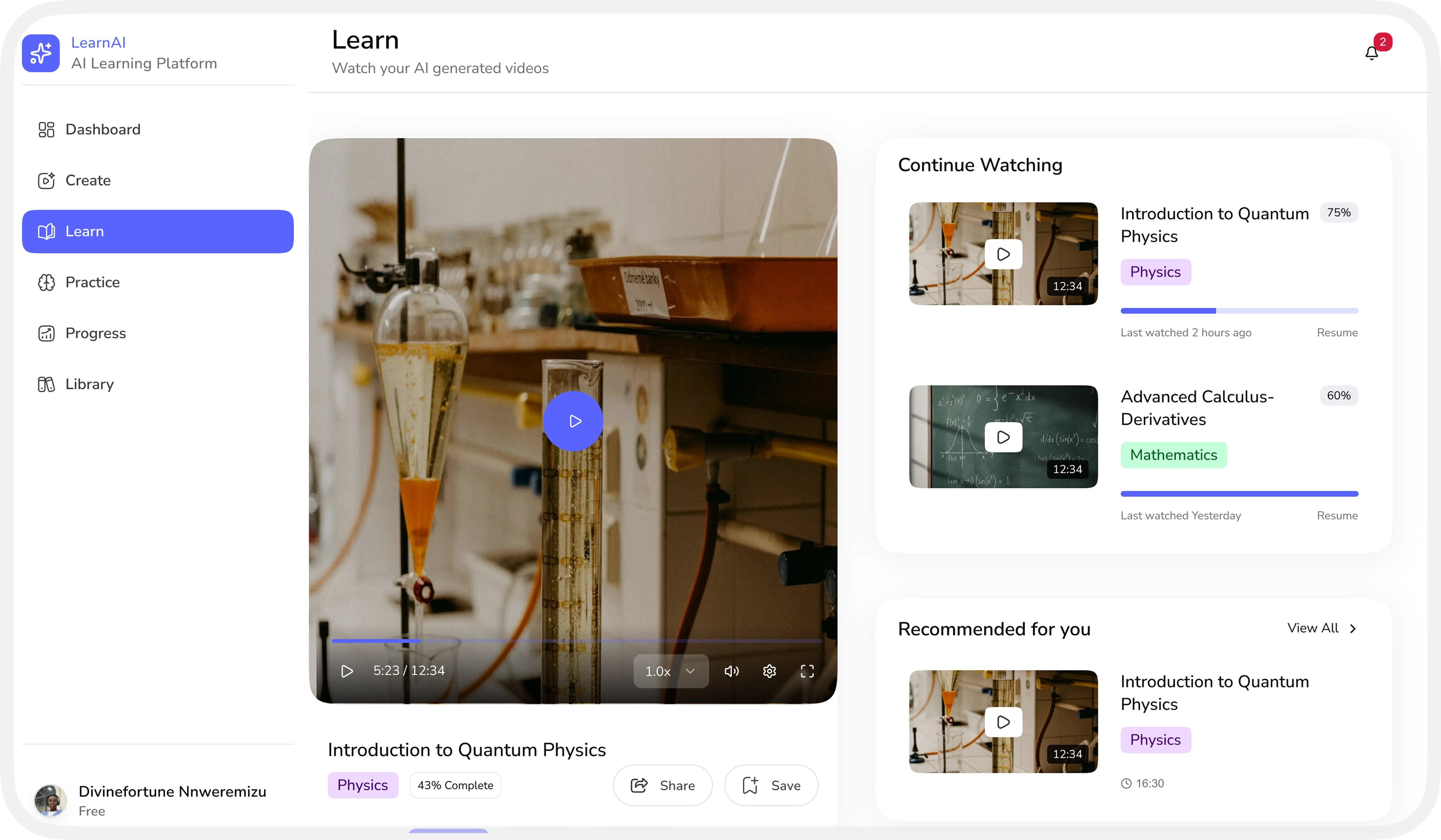
Every topic becomes a short, AI-generated video, paced and explained the way a great tutor would.
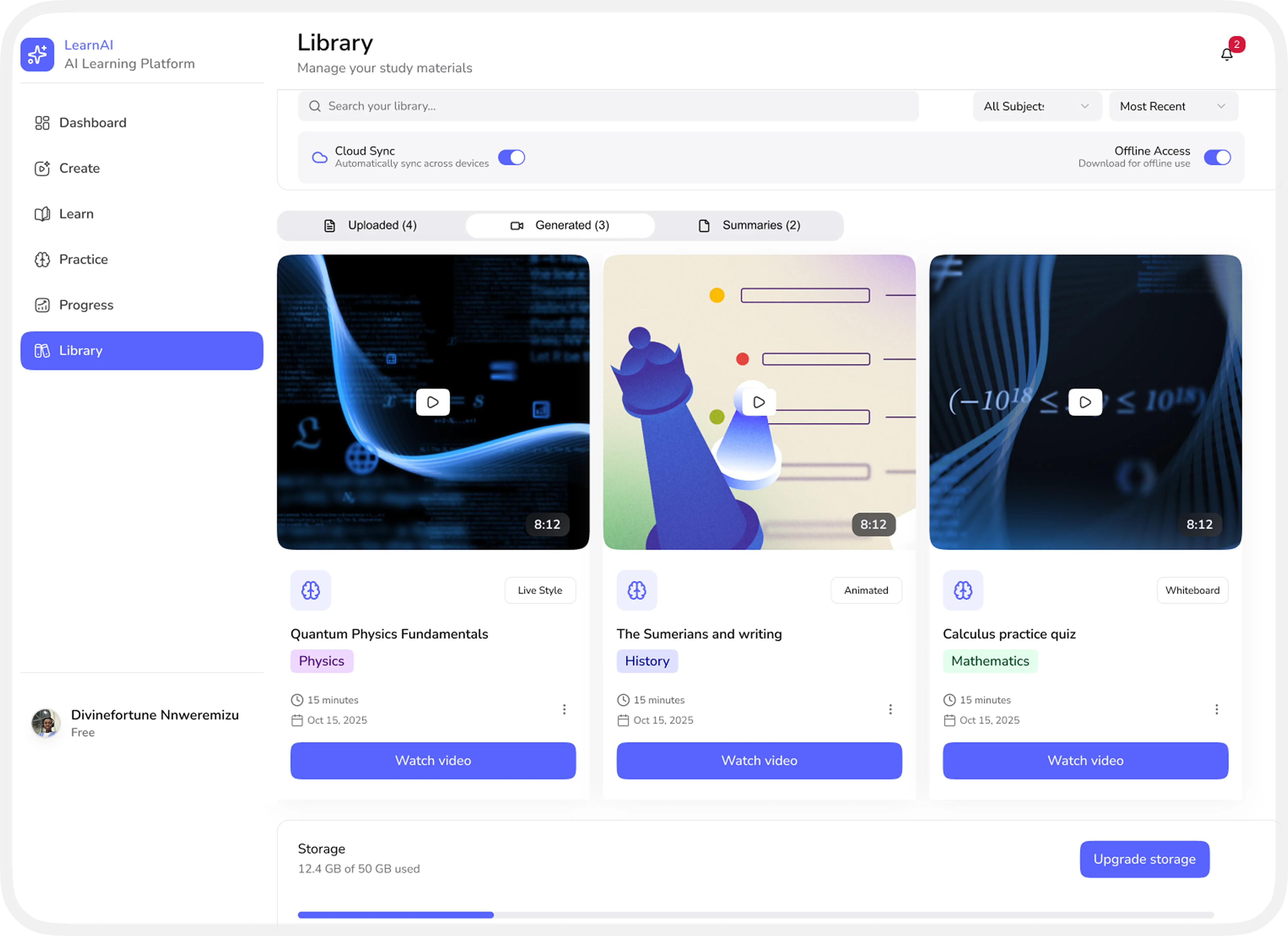
Every generated video and summary lives in one organized library, synced and ready offline whenever you need it.
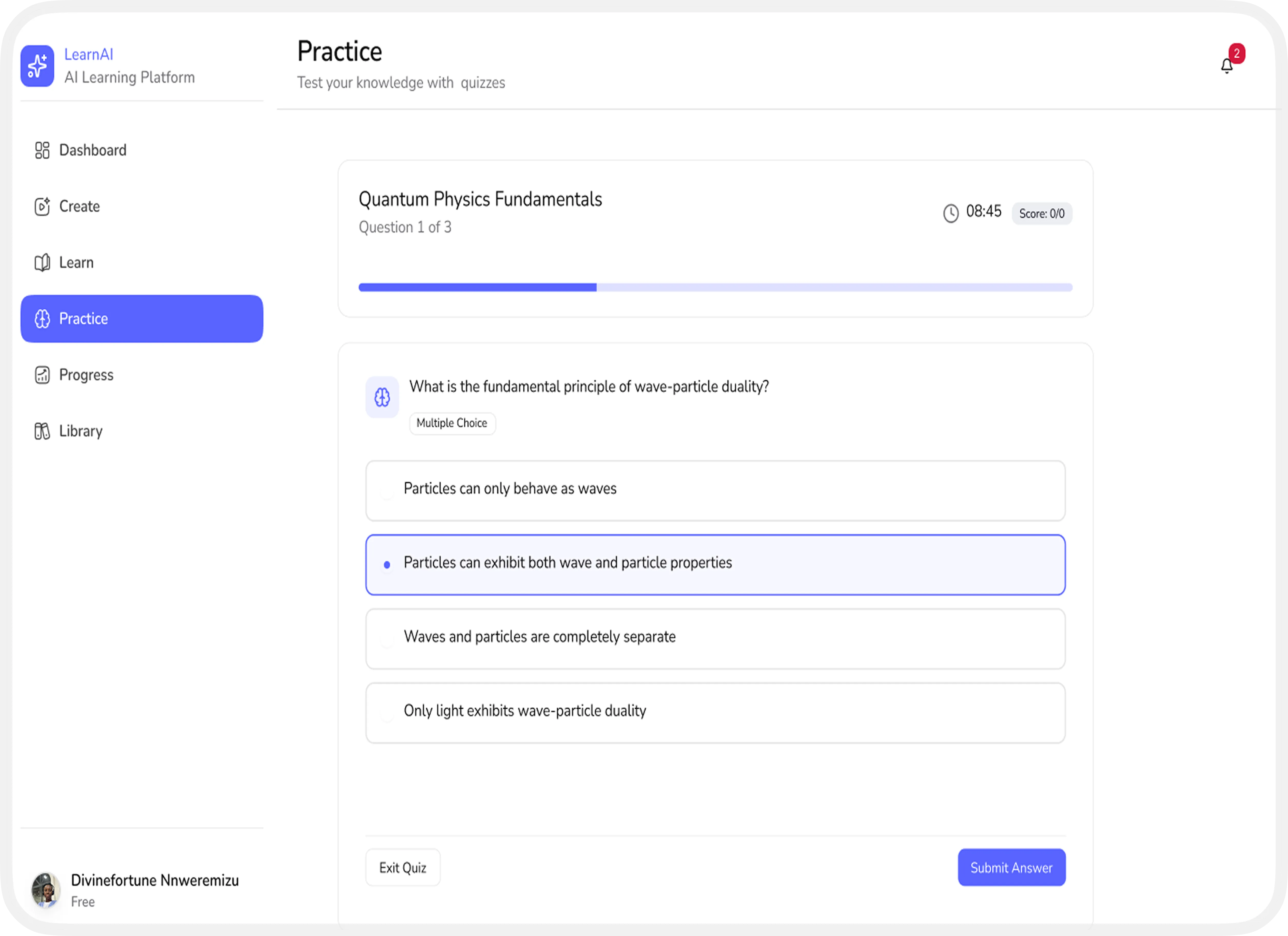
Quick, adaptive quizzes test what actually stuck, right after each lesson.
Track study time, quiz scores, and strengths at a glance, with clear next steps to focus on.
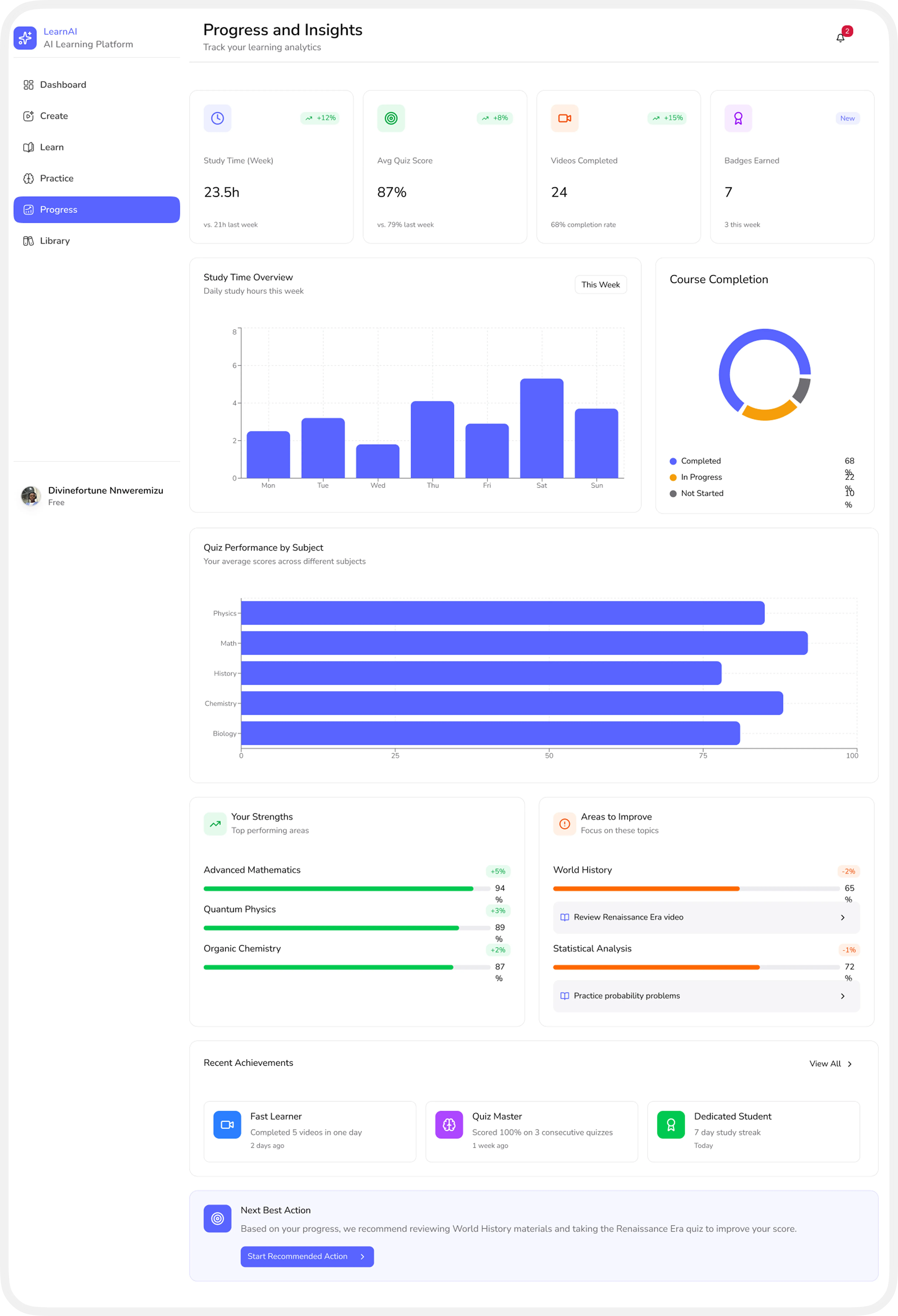
Accuracy of content interpretation Risk of oversimplifying complex topics Dependence on quality of uploaded materials
Video generation is resource-intensive Scalability across subjects and formats Performance considerations on low-end devices
Ensuring videos, text, and interactions meet accessibility standards Supporting diverse learning needs
Students must trust generated content Transparency about AI limitations is essential
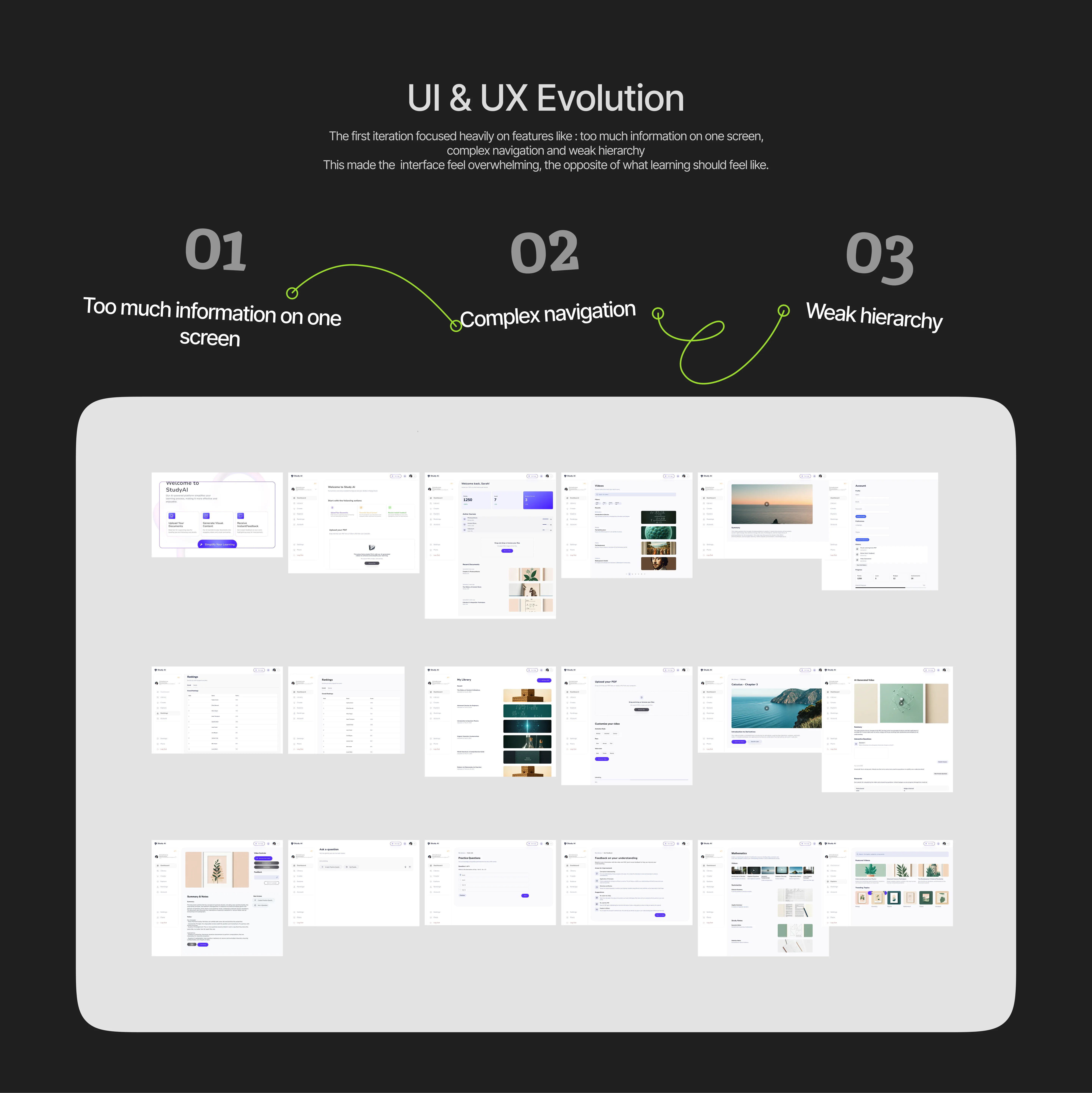
When learners feel confused or overwhelmed, their willingness to continue drops quickly. Designing calm, supportive experiences helps sustain curiosity and confidence throughout the learning journey.
If information is hard to scale or visually noisy, comprehension suffers. Clear hierarchy, spacing, and visuals are not aesthetic choices as they directly enable understanding.
Content alone doesn’t guarantee learning; learners need to know what they understood and what they didn’t. Timely, specific feedback turns passive consumption into active improvement.
Students absorb information differently, some through visuals, others through text or practice. Effective EdTech adapts to these differences instead of forcing everyone into a single learning path.
This project represents my belief that education should adapt to the learner, not the other way around. By combining AI, visual learning principles, and thoughtful UX design, this platform aims to help students not just study, but truly understand.
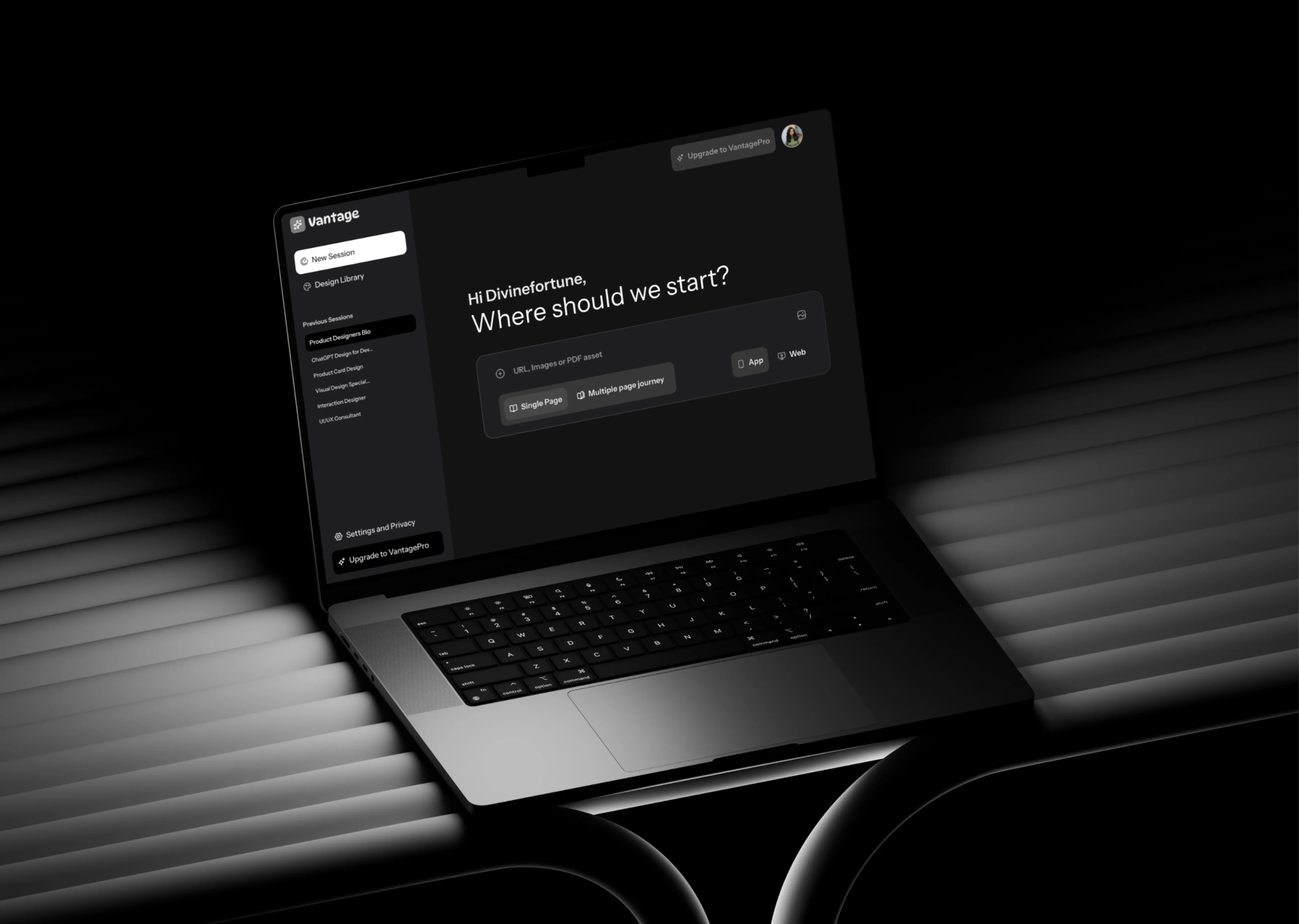
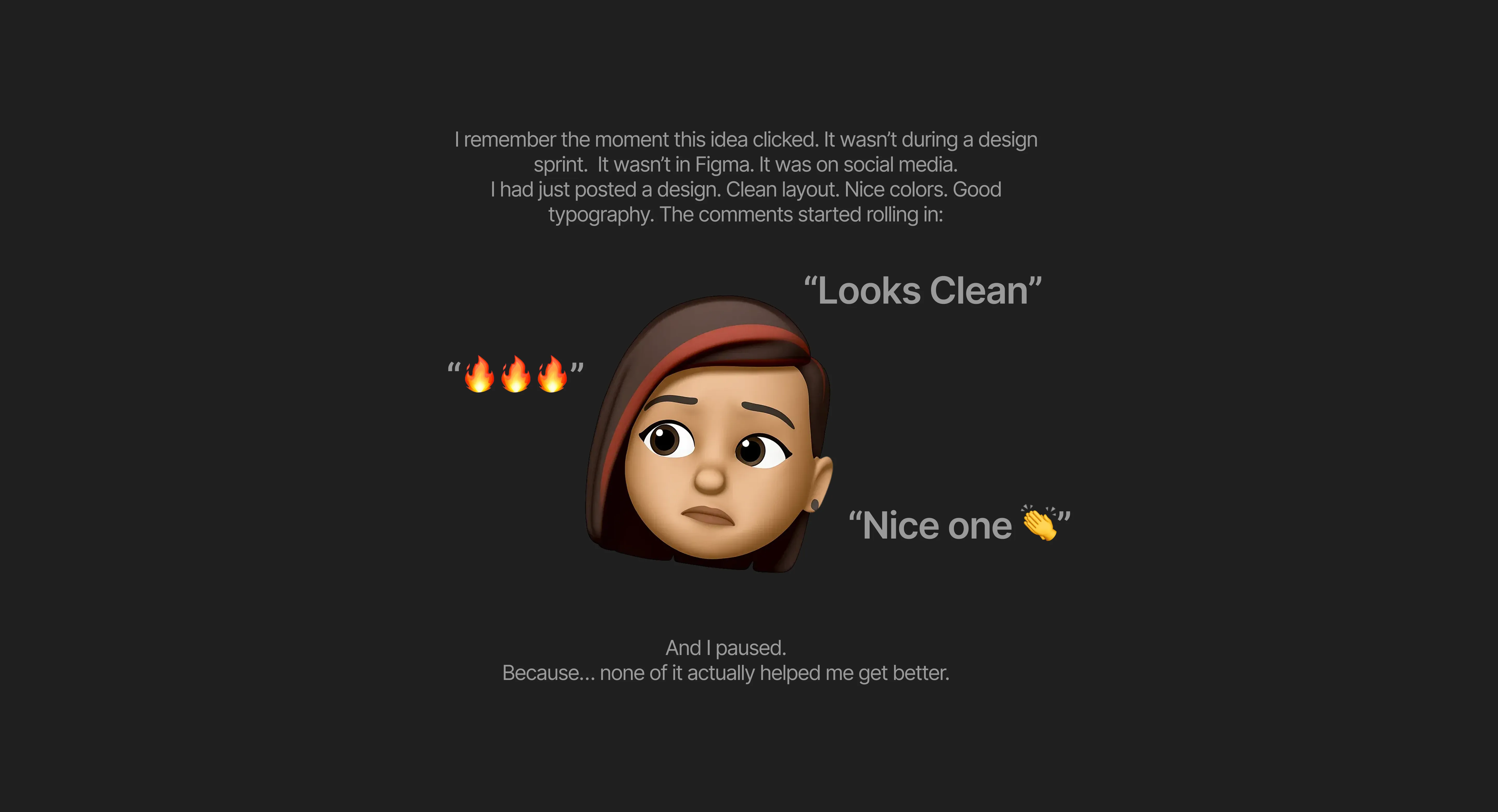
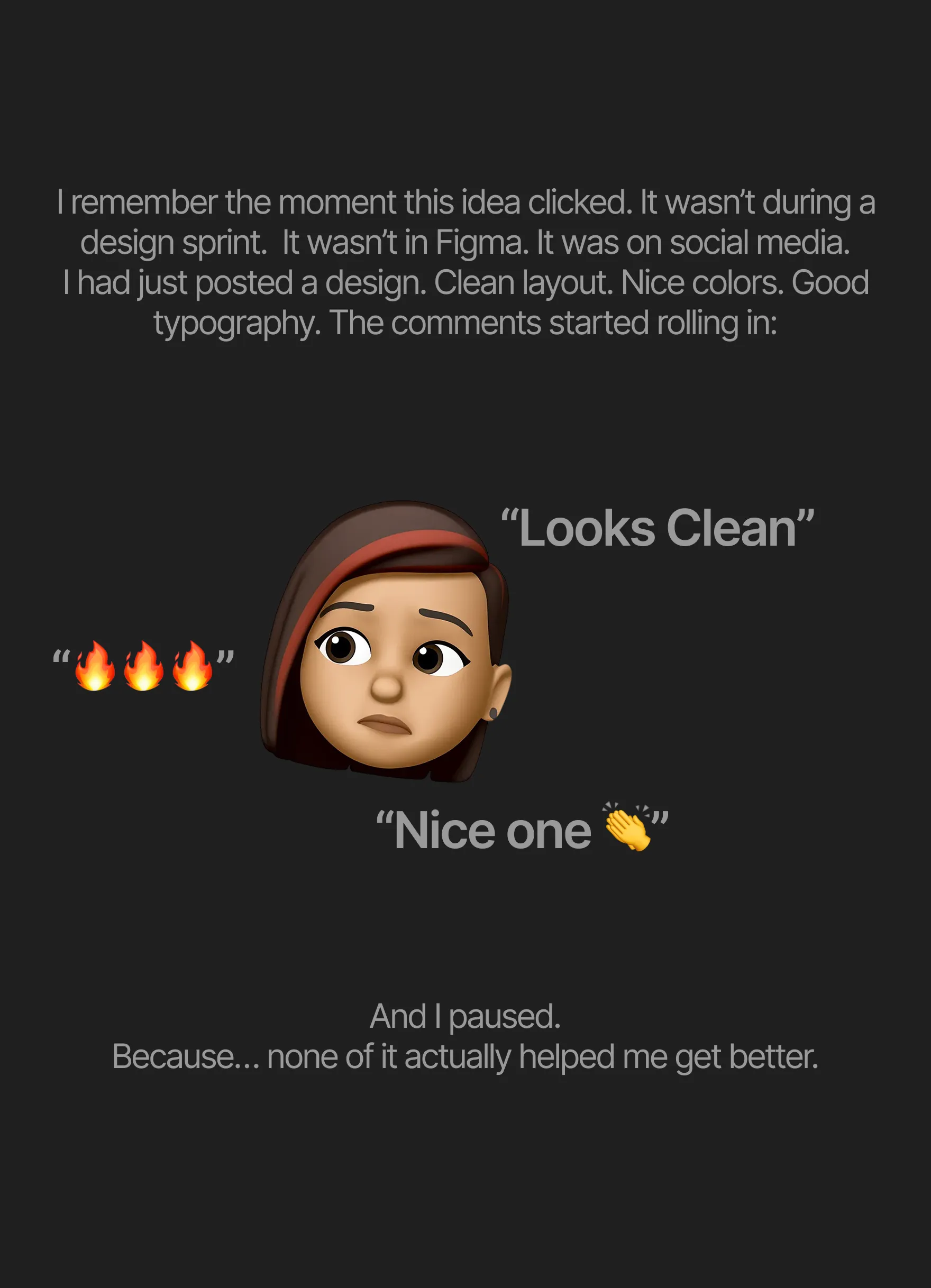
That question led to one idea:
What if every designer had access to a senior-level critique system… on demand?
What if every designer had clear, principle-based feedback, every single time.
That’s how Vantage AI was born.
The more I observed this, the clearer the gaps became:
Non-actionable feedback → You don’t know what to fix
Limited access to experts → Senior designers are expensive and scarce
Mental overload → You’re trying to remember things like Fitts’s Law, accessibility
rules, spacing systems… all at once
Designers were lacking Feedback and Structured Thinking.
And that was the real problem.
That moment exposed something deeper about the design industry.
We’ve built a culture where validation is loud… but improvement is quiet.
Designers, especially growing ones like myself, are stuck in what I call an echo chamber.
You share your work on platforms like Dribble or X (formerly Twitter)…
…and what comes back is mostly subjective praise.
Not because people don’t want to help, but because:
Most feedback is based on taste, not principles
Real UX critique is hard to scale
And honestly, not everyone knows what to look for
So designers start optimizing for what gets attention…
instead of what actually works.
That’s how you get beautiful designs that fail in real life.
Key Features
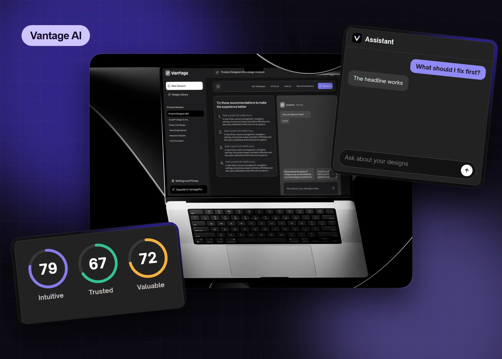
Drop in a design, get a senior-level critique, then fix, re-analyze and keep a record. Watch the whole loop first, then see each move.
The launch video, in seven steps
Designers can upload mock-ups, Figma links and prompts for their goals. They choose between “Single Page” or “Multiple Page Journey” and toggle between Mobile App or Web App for better feedback.
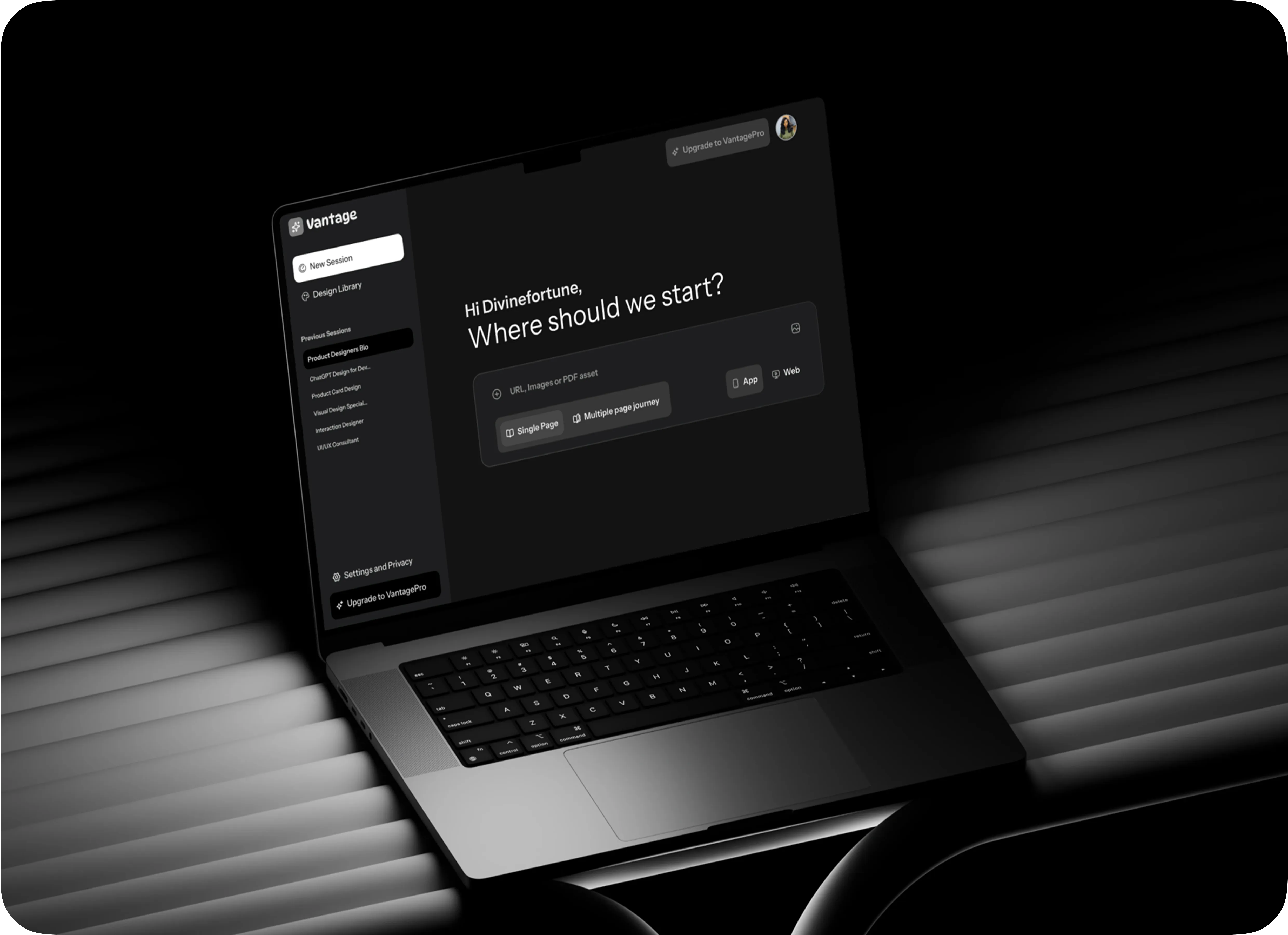
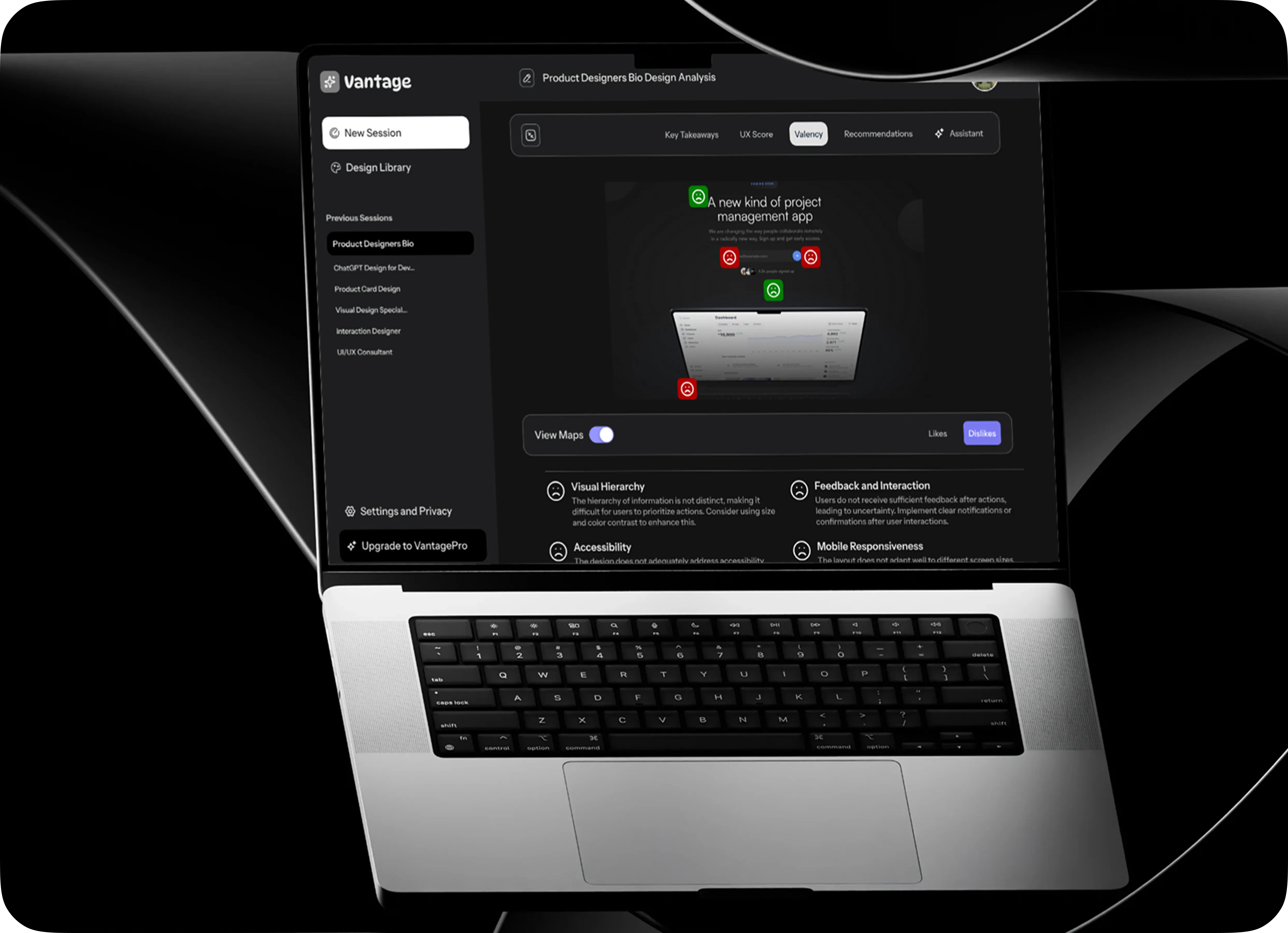
A summary page for key takeaways, UX score and recommendations. It gives designers an overview of design quality, combining visual previews with performance indicators, and highlights usability and accessibility issues directly on the design.
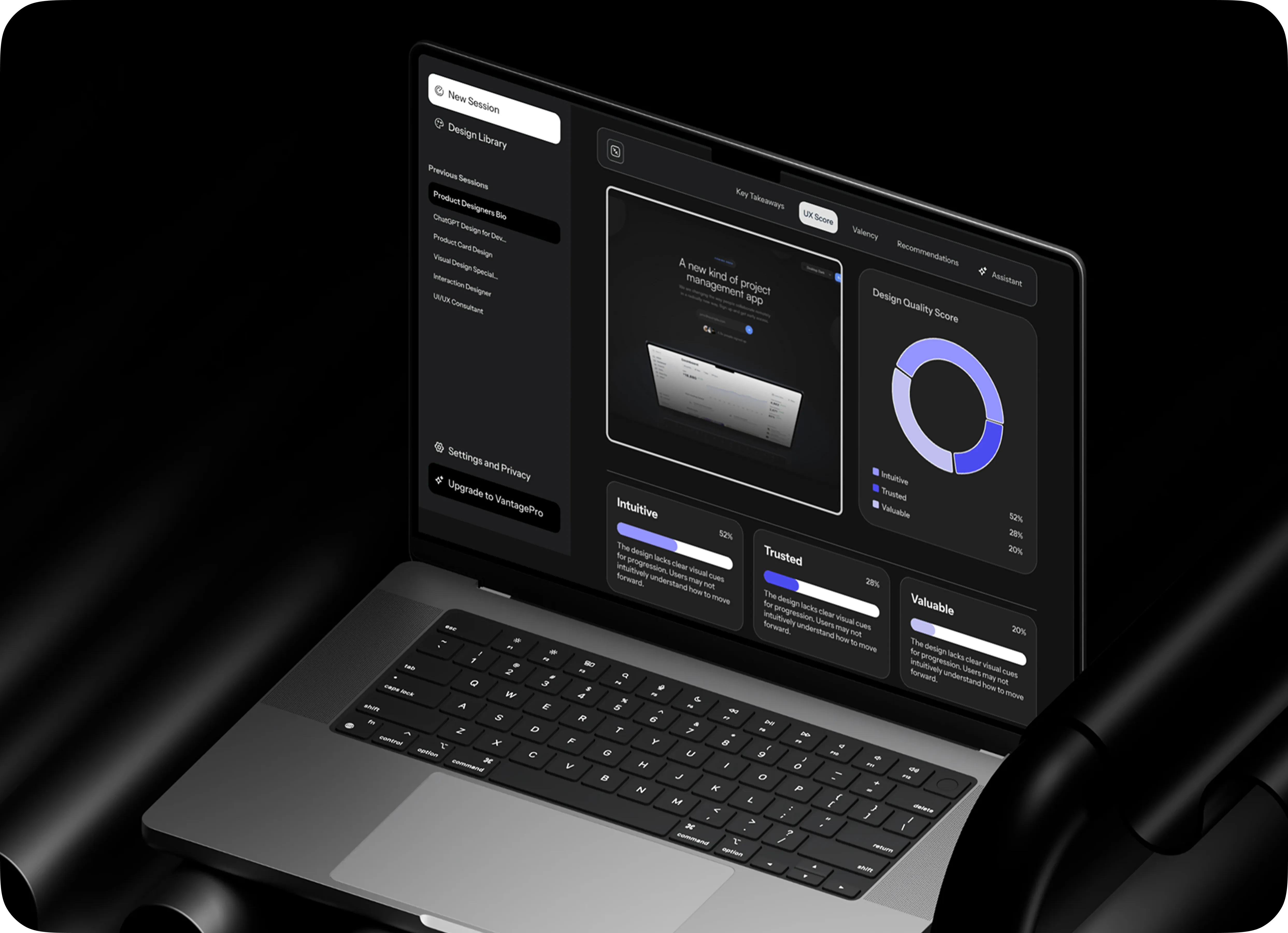
This tool shifts from seeing problems to fixing them. It structures feedback, highlights key issues and guides designers with prioritized recommendations, turning a static design into a living critique system.
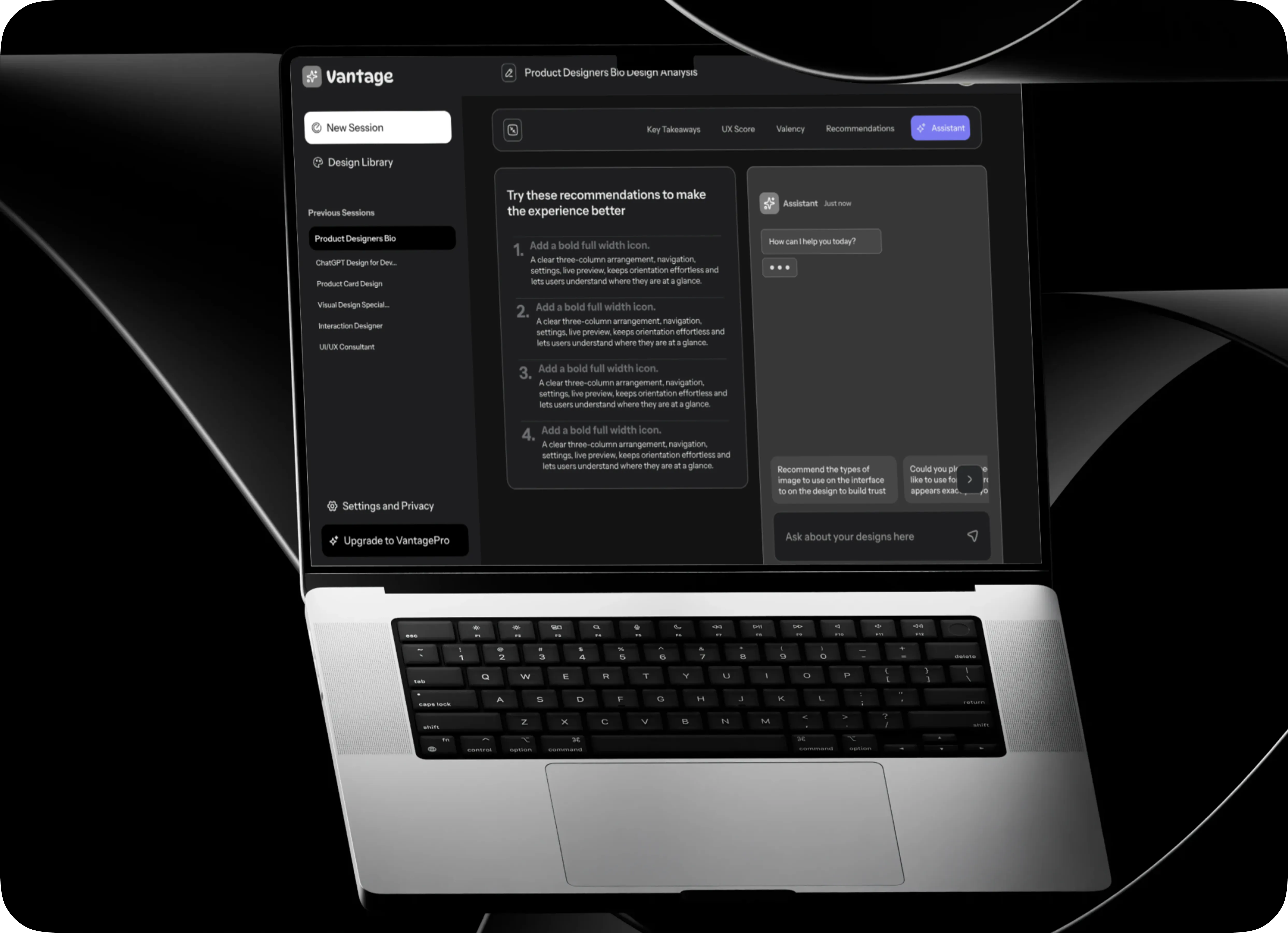
The AI Assistant chat is a real-time partner. Designers can ask “Why is this a problem?” or “How can I improve accessibility?” and get instant, tailored answers. It reduces reliance on mentorship and speeds up decisions.
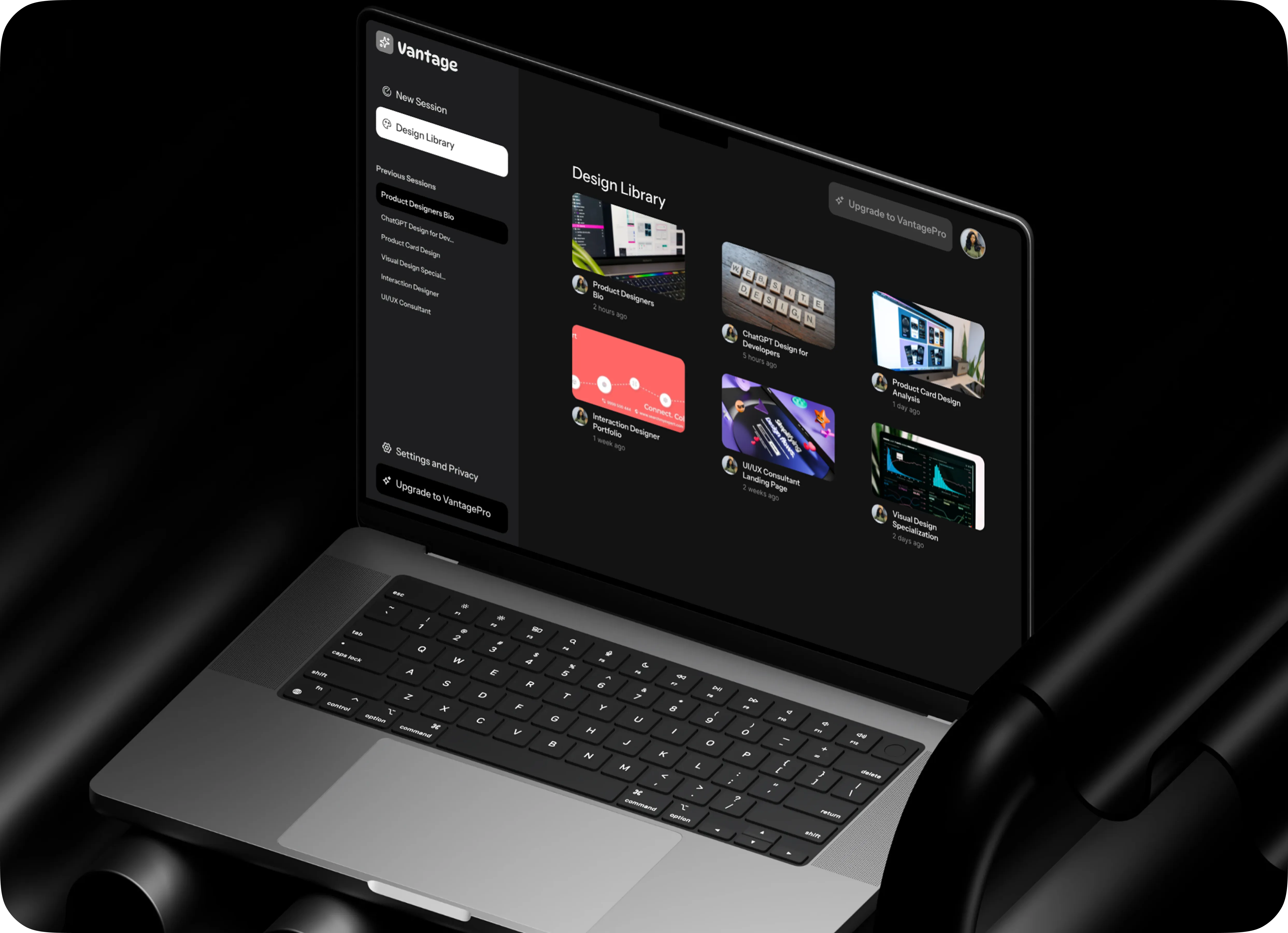
The Design Library is the hub for all projects. It shows past and ongoing work for easy revisits and analysis, and structures projects as visual cards to cut navigation friction. Design becomes an iterative process where designers track progress and refine.
See it working on a real design.
View live link Watch video case study